What is rasterisation? What about anti-aliasing?
If you've ever wondered how fonts go from a series of dots and lines to pixels on your screen, this 🧵 is for you.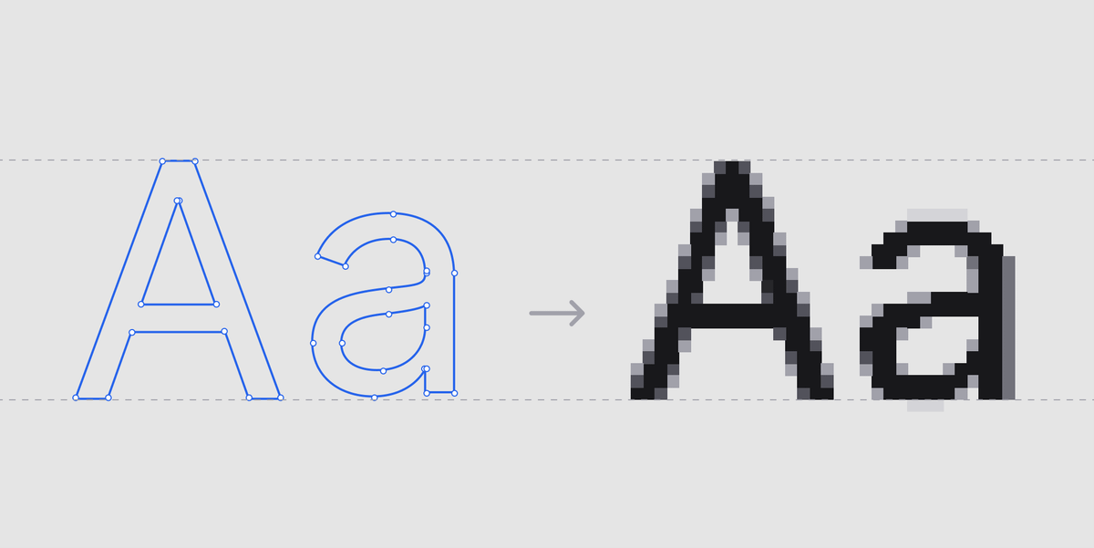
Lets start from the top.
When a type designer designs a font they create all the characters as vectors, just the like you would in Figma with the pen tool.
That's all an .otf, .ttf or .woff file is.
A bunch of co-ordinates that tell a computer how to draw each character.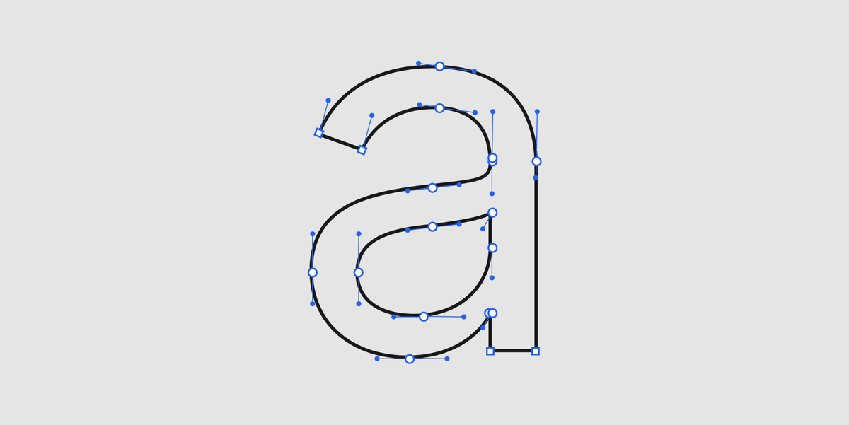
Vectors are great - they don't lose fidelity as they scale, so you don't have to design all the characters at different sizes.
The problem is that screens are made up of square(ish) pixels which don't play nice with the gentle curves of a vector.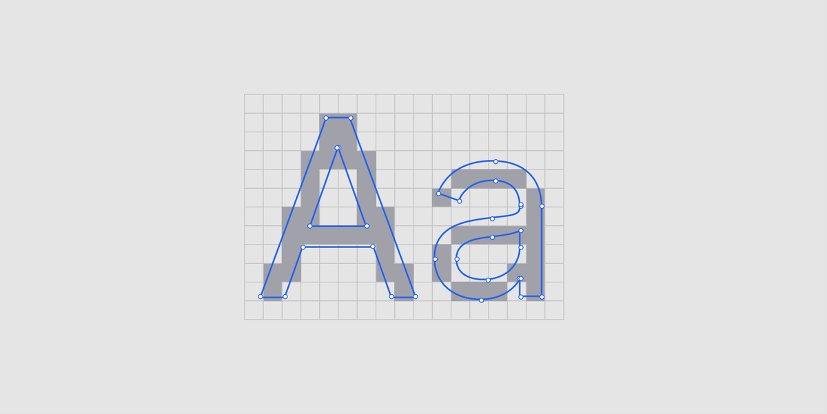
This is where rasterisation comes in.
It's the process of approximating a vector in pixels.
In its simplest form, the computer just works out which pixels fall inside the shape and colours them in.
At large sizes and resolutions, this kinda works fine.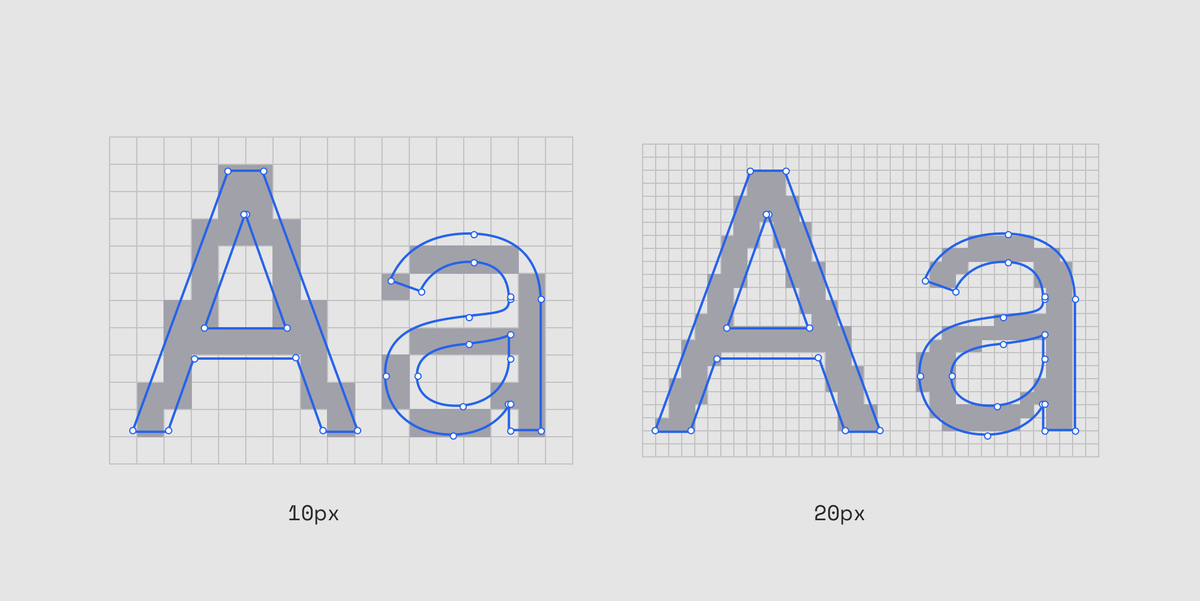
But at lower sizes and densities this strategy doesn't work so well.
Characters lose their legibility and for any given character there are different ways you could fill the shape.
Some prioritise legibility and others prioritise the original design.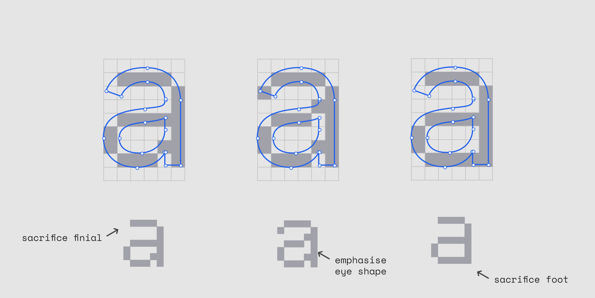
Fun fact: in the early days of Windows type designers would manually set hints in the font to tell the computer which strategy to choose for each character.
Each of the 890 characters in Verdana were redesigned for each size between 9pt and 60pts. 🤯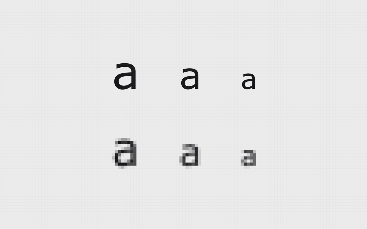
Anyway, to solve the legibility problem a strategy called anti-aliasing is used.
In the simplest form, the computer figures out what percentage of a pixel is covered by the shape and fills the pixel with that percentage of the colour - in this case grey.
When compared to plain rasterised text, you can see how the anti-aliasing improves the legibility of curves and and diagonal lines.
Those jagged lines are know as aliasing - hence the name anti-aliasing.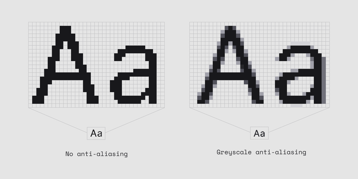
This is responsible for that grey blurriness you see on a low res screenshot.
Anti-aliasing is used all the time. From text rendering to photography to 3D rendering.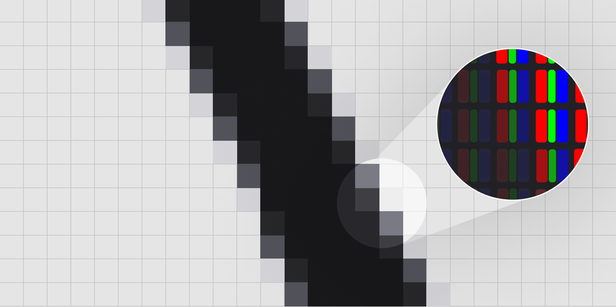
There is another interesting strategy called sub-pixel anti-aliasing (or rendering)
This takes advantage of the red, green and blue sub-pixels that make up each pixel.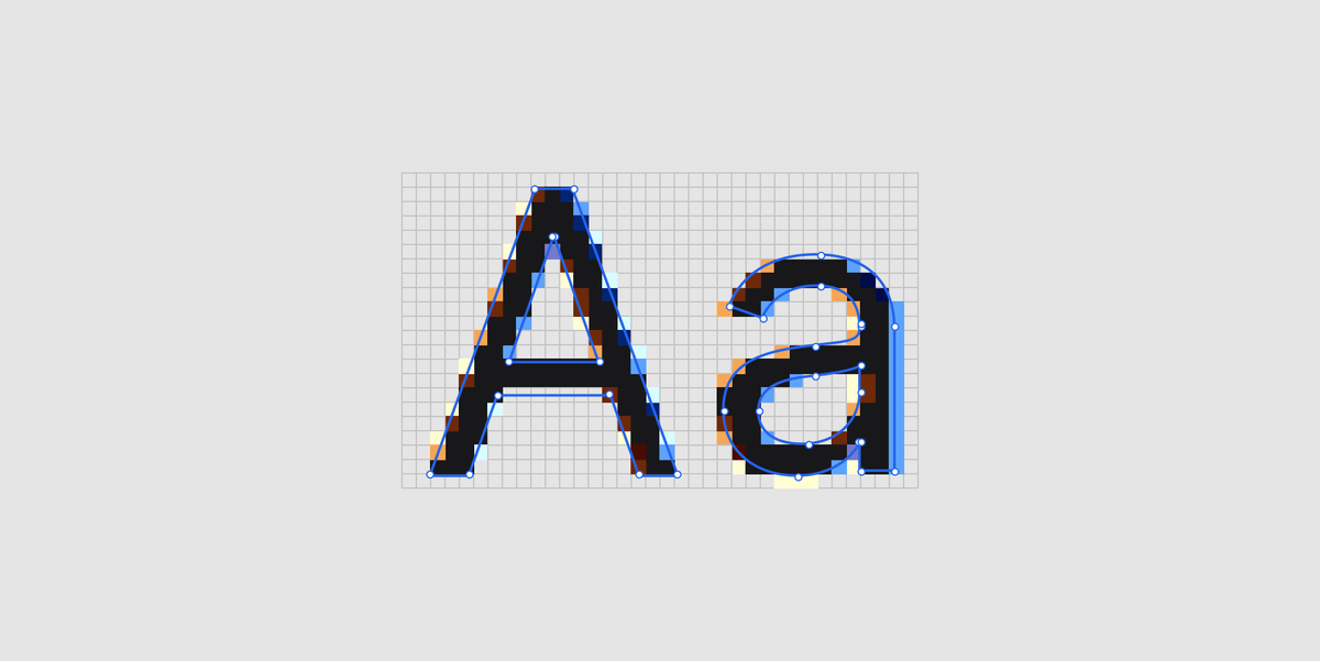
Sub-pixel AA is doing the same thing as grayscale AA but dimming part of the pixel, rather than the whole pixel.
This effectively triples the resolution of a display but only in the horizontal direction.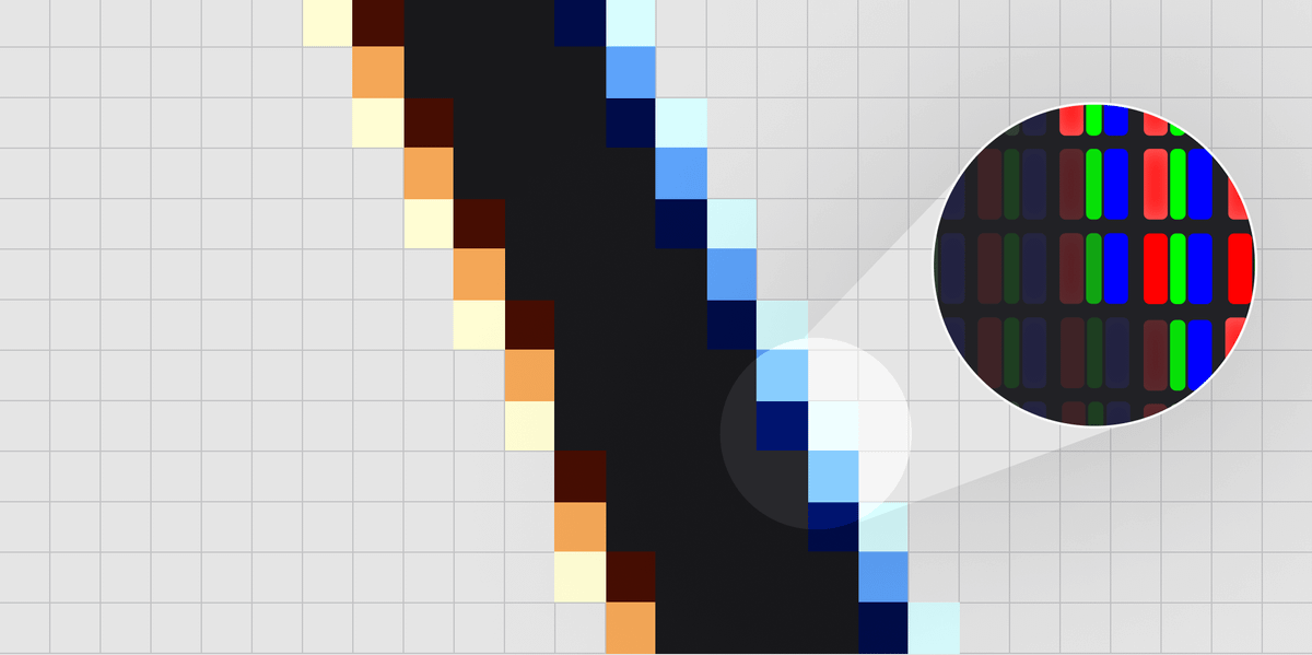
If you've ever seen a screenshot where the text has some weird coloured fringing, this is sub-pixel rendering.
it may seem odd compared close up like this but our brains are experts at tricking us and filling in the details.
I think Apple actually dropped sub-pixel rendering with the introduction of the Retina display.
Above a certain resolution it's not worth it anymore but some other platforms still use it.
Anyway, that's it. Quick recap:
-Rasterisation is the process of figuring out how to represent a vector as a set of pixels.
-Anti-aliasing is a strategy to improve the perceived sharpness of text at a low resolution. And also other things.
If you want to dive deeper on this stuff, here are some links:
typotheque.com/articles/hinting
alienryderflex.com/sub_pixel/

Dan Hollick
@DanHollick
design engineer @tailwindcss. writing a book about software at makingsoftware.com prev: @raycastapp