
This past week, I designed a map of the historic flows of a section of the Yellowstone River... using @geo_coe's tutorial on creating REM's w/ @QGIS
I wanted to share my workaround since @TableauPublic can't handle raster data (directly).
#RandomQGIStoTableauStuff no. 19 🧵
twitter.com/professorkao/status/1747109233445720533?s=20
First, what are raster data? A raster is a grid of cells or pixels, where each cell has a specific value. In contrast, vector data are made up of points, lines & polygons.
GIS tools - e.g. @QGIS - can handle both raster & vector data, but @TableauPublic can only handle vector.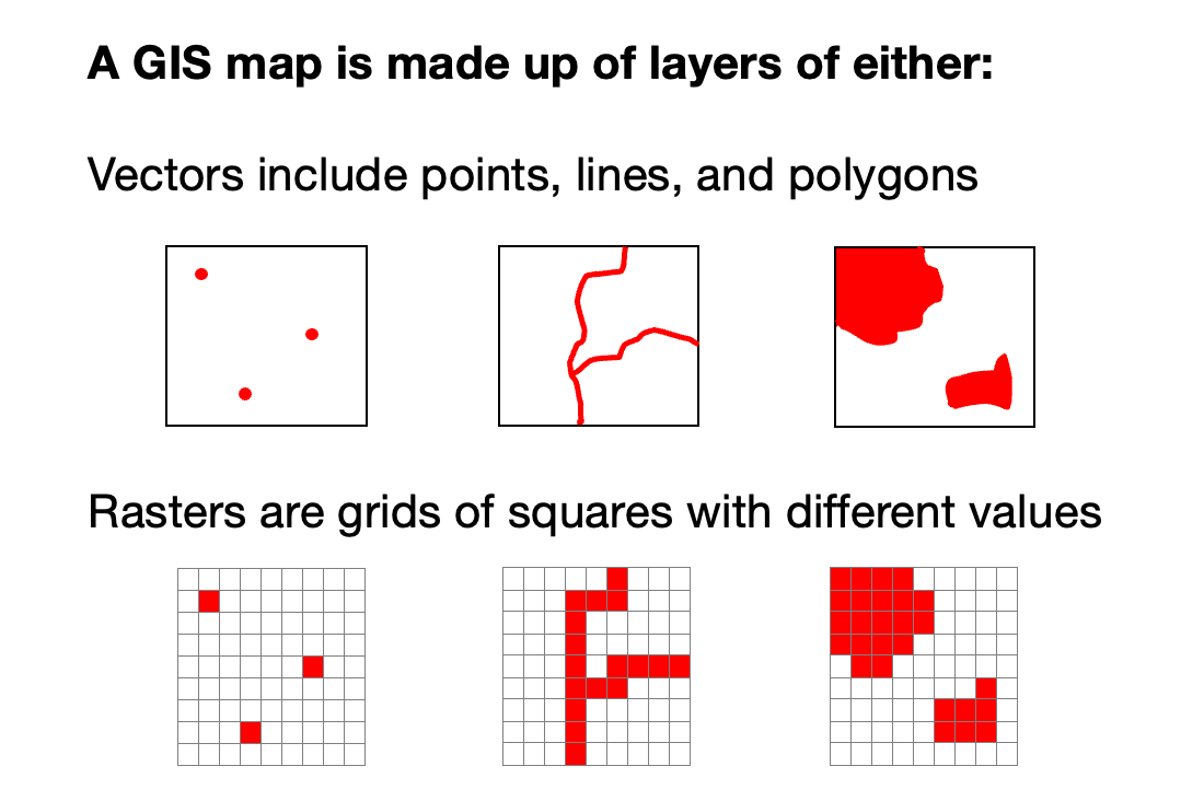
Once you work through @geo_coe's tutorial, you'll end up w/ a raster like the one shown.
From there, a workaround is needed to get it to work w/ @TableauPublic... my approach was to create a vector layer (point grid) that mimics the raster layer.
There are 3 main steps: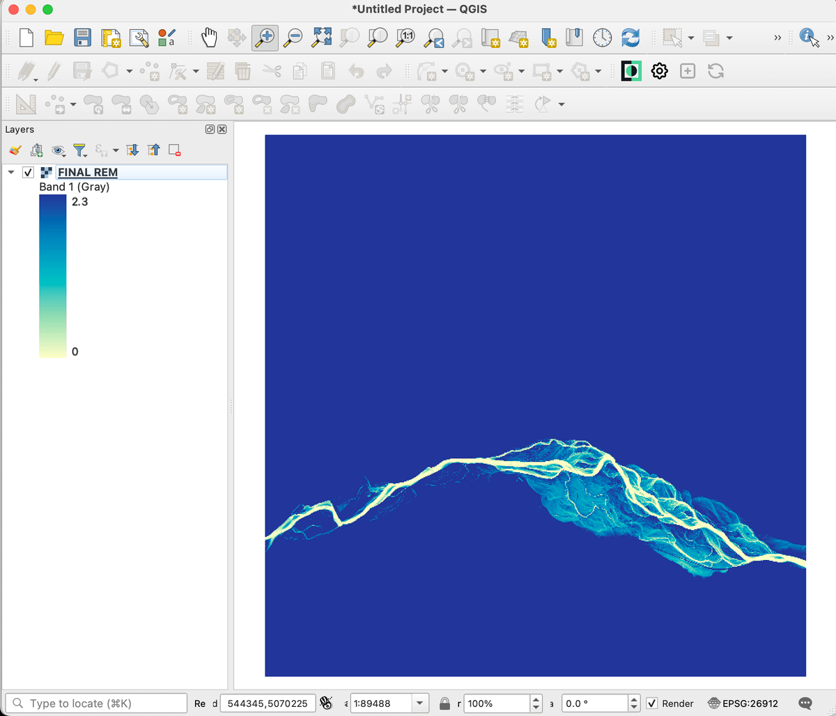
STEP 1: To focus the final view & minimize the size of data file...
I created a new temporary scratch layer (polygon) & drew a rectangle around desired area
I used the "Clip Raster by Mask Layer" tool to clip the raster to the rectangle layer... resulting in a smaller raster
STEP 2: To create the point grid, I experimented w/ different spacings & ended up using 5 meters... which seemed to work well
Note that we began w/ a 1m DEM file so 1-meter would improve the resolution, but the data file was too big. On the other end, 10m was too pixelated.
STEP 3: I used the "Sample Raster Values" tool to extract the raster values from the clipped REM layer & assign values to each point in the grid layer
The result is a vector layer (points) that can pulled into @TableauPublic. I saved the new "Sampled" layer as a shapefile.
It's still a big file... I had 650K+ points! So be patient 😅
In @TableauPublic...
Drag "Geometry" to the view
Set Mark Type as Circle
Drag "Id" to Detail
Drag "Sample 1" to Color... remove border... adjust color palette & range for the desired effect (somewhere btwn 0 - 10)
Again, here's the link to the workbook: tabsoft.co/4aWGWv8
Thanks for reading... I hope you found it helpful.
When I shared this map earlier this week, the response was so overwhelming... Thank you for your support! 🙏