#RandomQGIStoTableauStuff #14
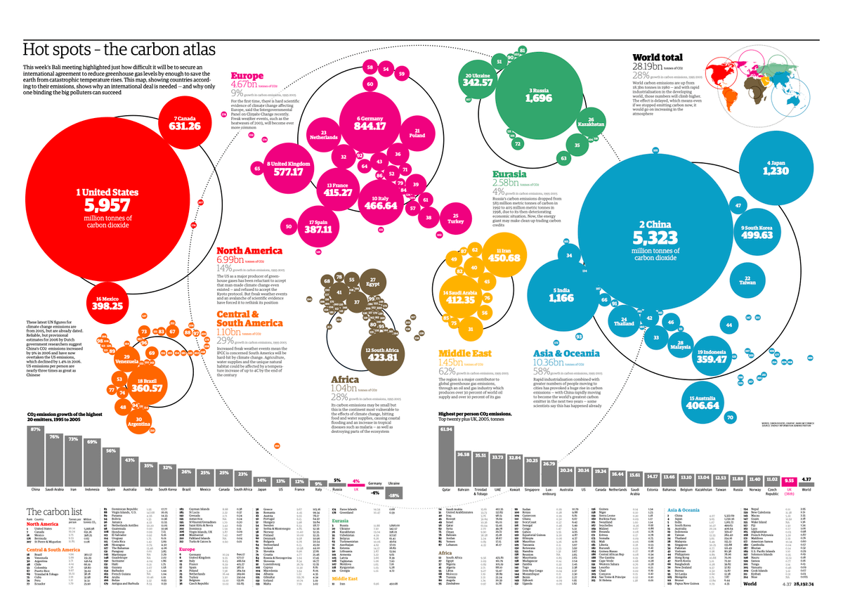
Dorling cartograms - a la Prof @dannydorling - are another type of cartogram which uses proportional circles to depict areas.
Here's one way to create them @QGIS & visualize them @TableauPublic. This time, we will use a 3rd tool!
Image: @guardian
twitter.com/professorkao/status/1687266322181189632?s=20
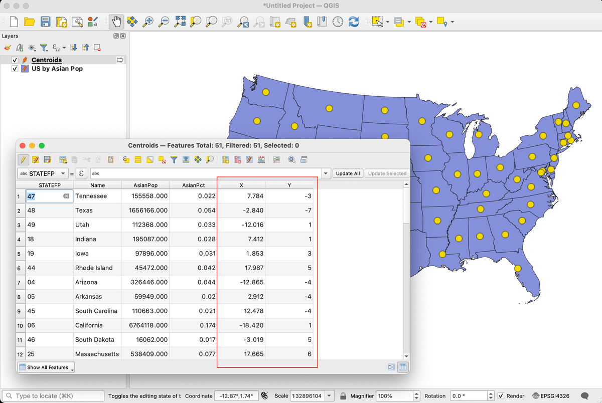
First, in @QGIS, you can use the centroid tool to create a map layer of geographic centroids for your target area.
For example, with the same US shapefile (w/ Asian population numbers), I end up with a new map layer containing the centroids for each state.
Next, we have to calculate x/y coordinates for the centroids, which I've described briefly in a previous thread. Then save as a CSV file.
Of course, we can visualize centroids in @TableauPublic w/o doing any of this, but we're trying to avoid the overlapping circles...
twitter.com/professorkao/status/1667480538129526784?s=20
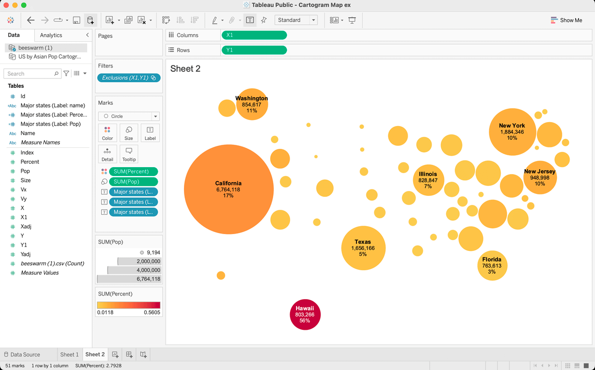
We can use @ladataviz's Beeswarm Generator to adjust the point positions to make room for the varying circle sizes (based on Asian pop).
To work, we first need positive x/y coordinate values, so in this case, I simply added 20 to each value (w/ the SUM function in @msexcel).
Once you get the desired effect, you're ready to visualize in @TableauPublic.
For a better (packing) effect, I might trying using @QGIS to move the centroids closer to each other. I go into moving features a bit in a previous thread.
Thanks...hope this was helpful! 🙏 😆
twitter.com/professorkao/status/1669961255614922752?s=20