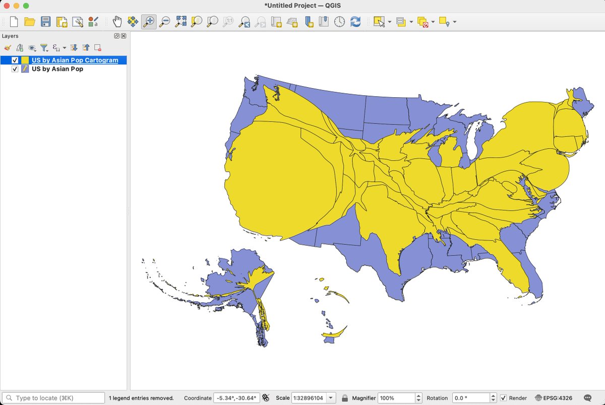
For #RandomQGIStoTableauStuff No. 13, let's take a look at:
CARTOGRAMS... maps that distort/resize geographic features based on a measure. Great examples at @worldmapper.
With the "cartogram3" plugin in @QGIS, it's quite simple to create them & then visualize in @TableauPublic.

The process in @QGIS s fairly straightforward.
In this example, I started w/ a shapefile of the US, to which I joined data on the # of Asians for each state.
Running the "cartogram3" tool results in a new layer of states resized based on their Asian population size.
You can save this new layer as a shapefile & then visualize it in @TableauPublic.
By normalizing geographic size (e.g. states), these "density-equalizing" cartograms can be effective tools to highlight geographic differences.
And they're kind of fun.😁
Hope this is helpful.🙏


