Plotly is a powerful lib to visualize the data in an interactive manner📊📈
Let's find out how you can use plotly to visualize teaching and ranking scores of the universities w.r.t. number of students enrolled🧵👇
1/ First of all we will download the dataset for the project for visualization or you can use kaggle kernels to write the code
I have used the latest rankings dataset available in kaggle
Dataset link: kaggle.com/datasets/r1chardson/the-world-university-rankings-2011-2023
2/ Now use pandas to wrangle the dataframe in the desired format and use plotly to plot scatterplot between teaching and ranking scores along with number of students enrolled
See the code snippet below or visit the kaggle notebook link for entire code
🔗 kaggle.com/code/avikumart/world-university-rankings-data-viz#4.-How-many-students-TOP-Universities-have-had-over-period-of-last-5-years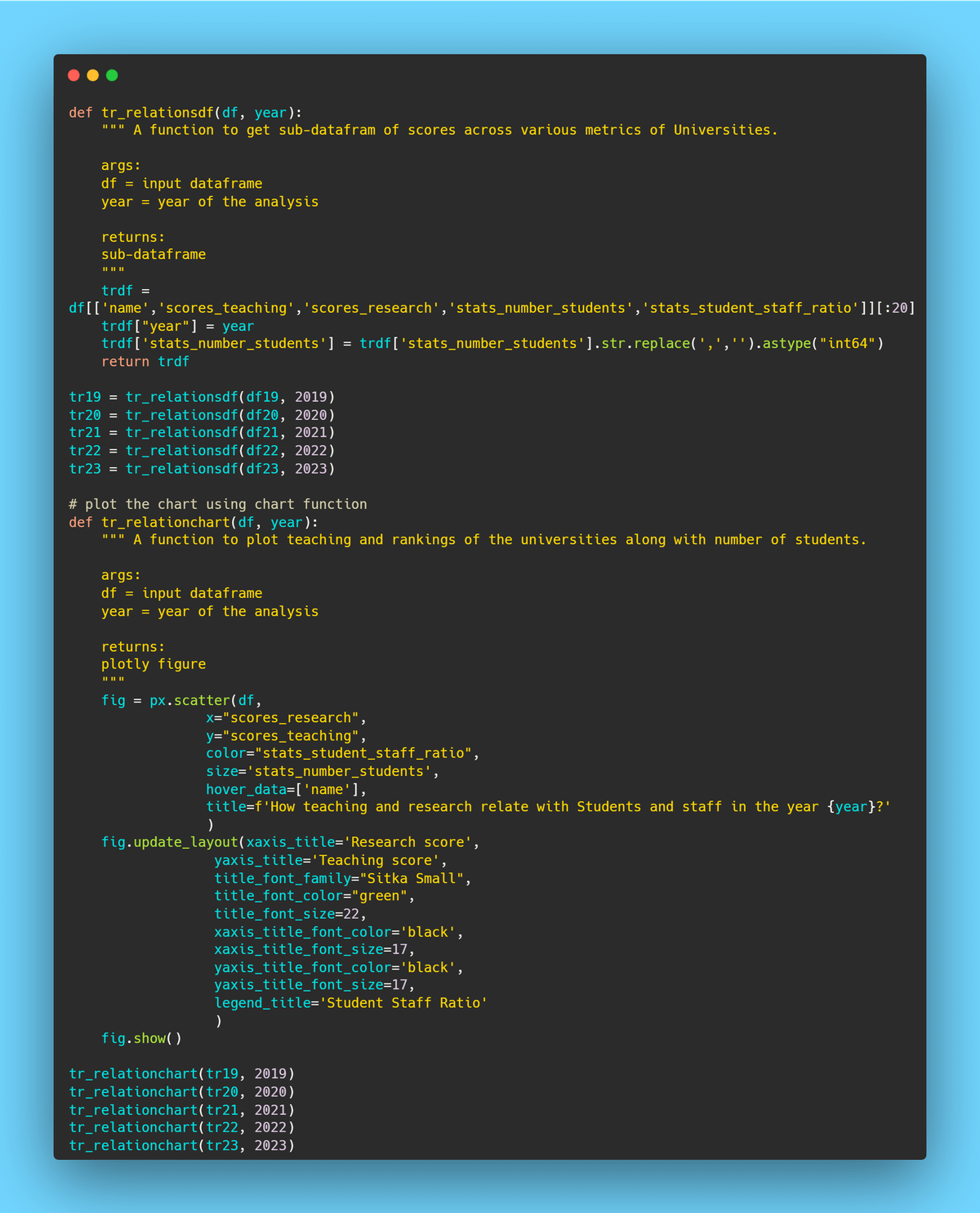
3/ And there you go, run the code and you'll get the visualization right into your notebooks environment
Here is the chart for the year 2022 for top-ranked universities👇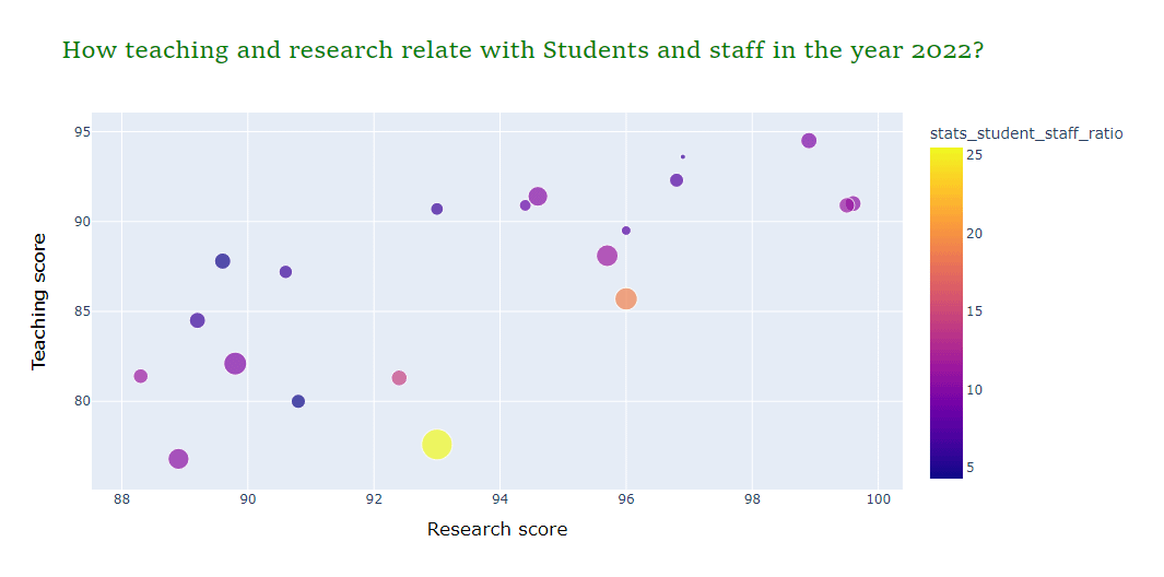
Here is the chart for 2023👇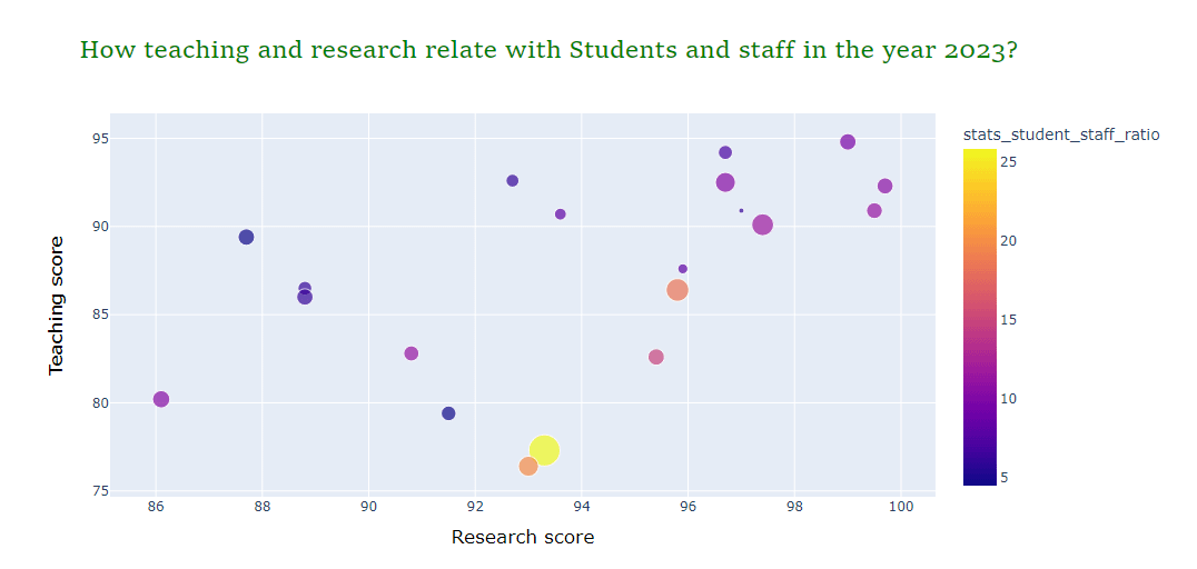
In conclusion, bubble chart is super useful is super useful for multivariate data analysis and help draw various insights out of the chart📊

Avi Kumar Talaviya
@avikumart_
Simplifying Data Science and Machine learning for beginners🤖 I share valuable threads & resources on DS/ML/DL @kaggle Master|Python|ML|Data|Analytics|Tech