Get fresh prompts and ideas whenever you write - with examples of popular tweets.
The best writing experience, with powerful scheduling
Create your content without distractions - where it's easier to write and organize threads.
Cross-post to LinkedIn
NEW
Automatically add LinkedIn versions to your posts.
+14
Followers
Discover what works with powerful analytics
Easily track your engagement analytics to improve your content and grow faster.
@frankdilo
Feedback?
@albigiu
Love it 🔥
Collaborate on drafts and leave comments
Write with your teammates and get feedback with comments.
🧵
Rewrite as thread start
🔥
Make it Punchier
✅
Fix Grammar
Improve your content with AI suggestions and rewrites
Get suggestions, tweet ideas, and rewrites powered by AI.
And much more:
Auto-Split Text in Tweets
Thread Finisher
Tweet Numbering
Pin Drafts
Connect Multiple Accounts
Automatic Backups
Dark Mode
Keyboard Shortcuts
Top tweeters love Typefully
100,000+ creators and teams chose Typefully to curate their Twitter presence. Join them.
Santiago@svpino
For 24 months, I tried almost a dozen Twitter scheduling tools.
Then I found @typefully, and I've been using it for seven months straight.
When it comes down to the experience of scheduling and long-form content writing, Typefully is in a league of its own.
I forgot about Twitter for 10 years. Now I'm remembering why I liked it in the first place.
Huge part of my new love for it: @typefully. It makes writing threads easy and oddly fun.
DHH@dhh
This is my new go-to writing environment for Twitter threads.
They've built something wonderfully simple and distraction free with Typefully.
ian hollander@ianhollander
Such a huge fan of what @typefully has brought to the writing + publishing experience for Twitter.
Easy, elegant and almost effortless threads - and a beautiful UX that feels intuitive for the task - and inviting to use.
Luca Rossi ꩜@lucaronin
After trying literally all the major Twitter scheduling tools, I settled with @typefully.
Kudos to @frankdilo and @linuz90 for building such a delightful experience.
Killer feature to me is the native image editor — unique and super useful 🙏
Queue your content in seconds
Write, schedule and boost your tweets - with no need for extra apps.
Schedule with one click
Queue your tweet with a single click - or pick a time manually.
Pick the perfect time
Time each tweet to perfection with Typefully's performance analytics.
Boost your content
Retweet and plug your tweets for automated engagement.
Start creating a content queue.
Tweet with daily inspiration
Break through writer's block with great ideas and suggestions.
Start with a fresh idea
Enjoy daily prompts and ideas to inspire your writing.
Check examples out
Get inspiration from tweets that used these prompts and ideas.
Flick through topics
Or skim through curated collections of trending tweets for each topic.
Check the analytics that matter
Build your audience with insights that make sense.
Write, edit, and track tweets together
Write and publish with your teammates and friends.
Share your drafts
Brainstorm and bounce ideas with your teammates.
@frankdilo
Feedback?
@albigiu
Love it 🔥
Add comments
NEW
Get feedback from coworkers before you hit publish.
Read, Write, Publish
Read, WriteRead
Control user access
Decide who can view, edit, or publish your drafts.
Why is making a dark mode greyscale so hard to get right?
Well, of course it has to do with the weird way humans perceive colour and contrast. 👇
The main issue is we we perceive contrast as higher between lighter colours.
Even though these two sets of colours have the same mathematical contrast we perceive the left as having more contrast than the right.
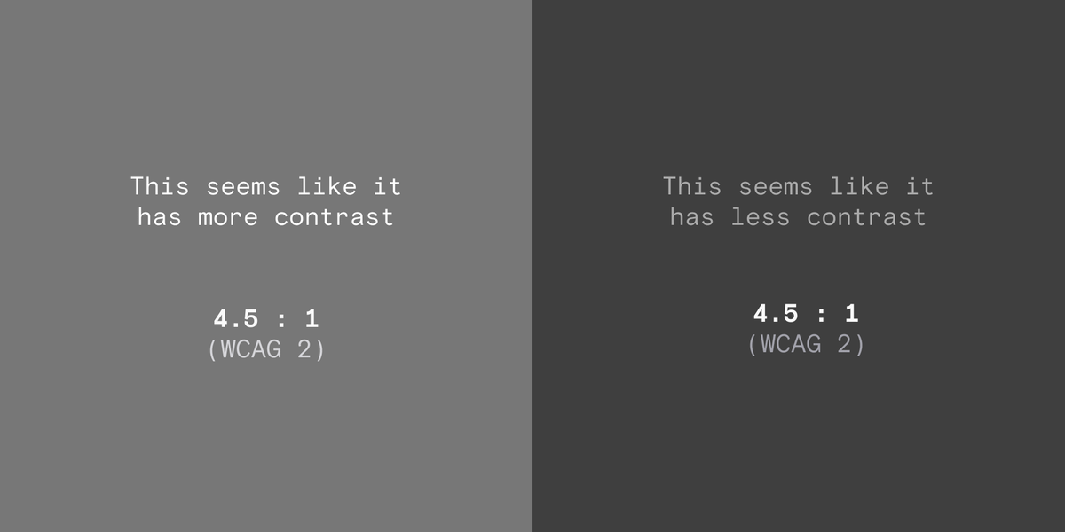
So in designs that use a lot of subtle light greys (containers, borders etc) it isn't as simple as just inverting the colour scale.
The contrast between darker greys will be lower as you can see below.
To fix this, you need to space the colours further apart to achieve the same contrast. This is tricky if your grey scale was set up for light mode.
One tactic I use is to create the scale based on the APCA contrast, which is much more reflective of human perception.
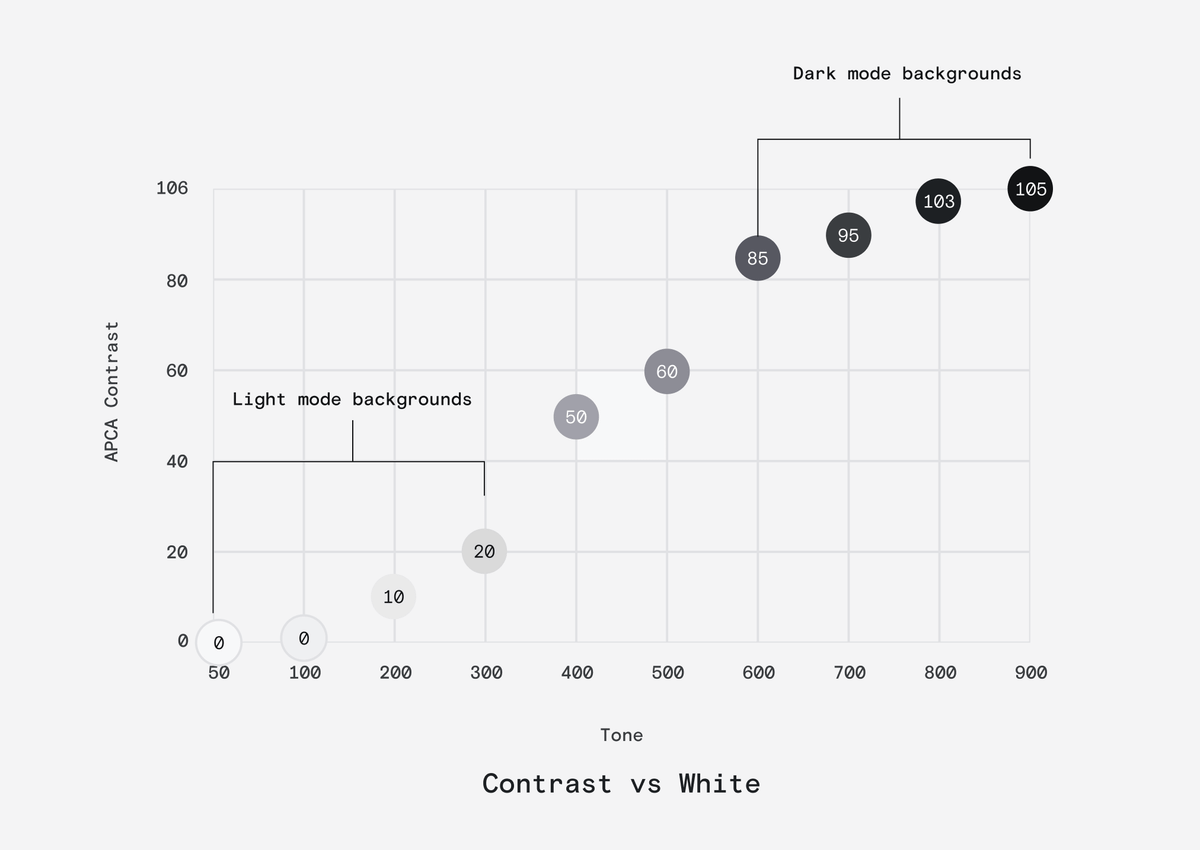
This ensure that contrast remains pretty consistent across modes even when you just flip the scale.
Not perfect but close.
So why do we tend to tint dark backgrounds blue?
Well, our perception of contrast isn't linear across hues. For instance, we perceive green as much brighter than blue.
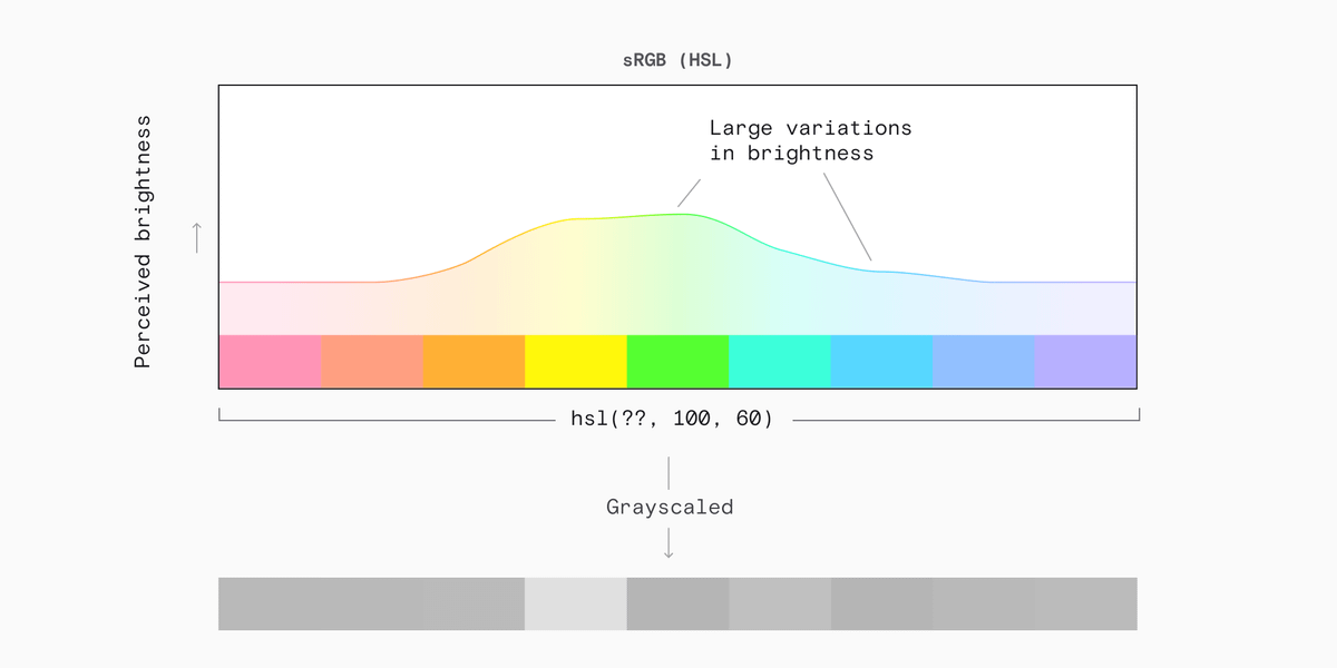
This means we are much more sensitive to a green tint than we are to a blue tint.
Adding green or red just alters the tone much more than blue does, and pure black feels unnatural to some.
Blueish-blacks are more common in nature too (night sky).
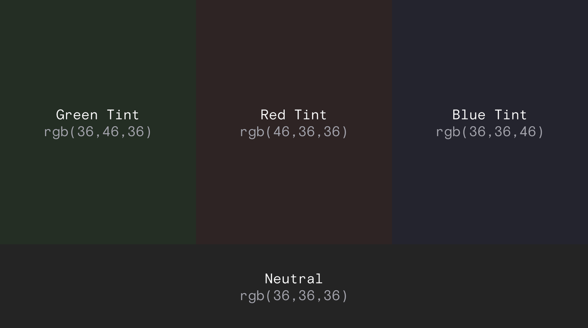
But, of course this complicates your grey scale.
As the scale moves from light to dark the hue component will also need to move gradually towards blue.
The blue tinting looks very weird in the lighter shades (just look at my profile picture)
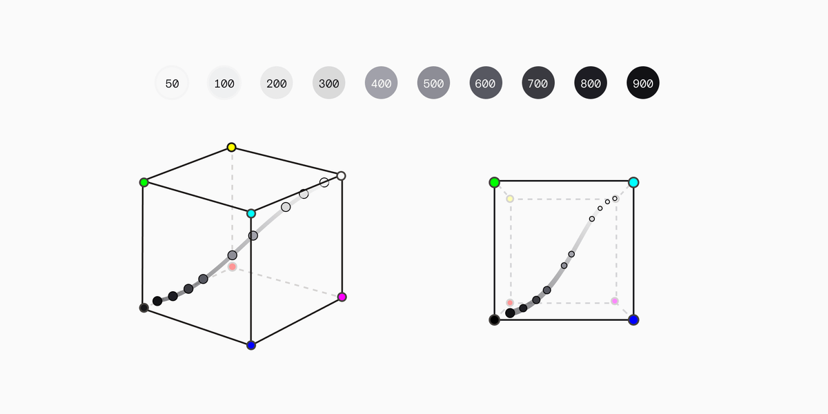
In summary, this shit is hard.
Below you'll find a bunch of threads I've done about some of this colour stuff before.
This one is about the difficulties of modelling human perception of contrast.
https://twitter.com/DanHollick/status/1417895151003865090?s=20