Talking of growth, there are 2 alternatives at a broad level:
1. realize churn, act in retrospect
2. build effective onboarding strategies targeting retention
Let's explore the onboarding experiences one can build over this thread🧵
#productmanagement #UX #strategy #design
1/n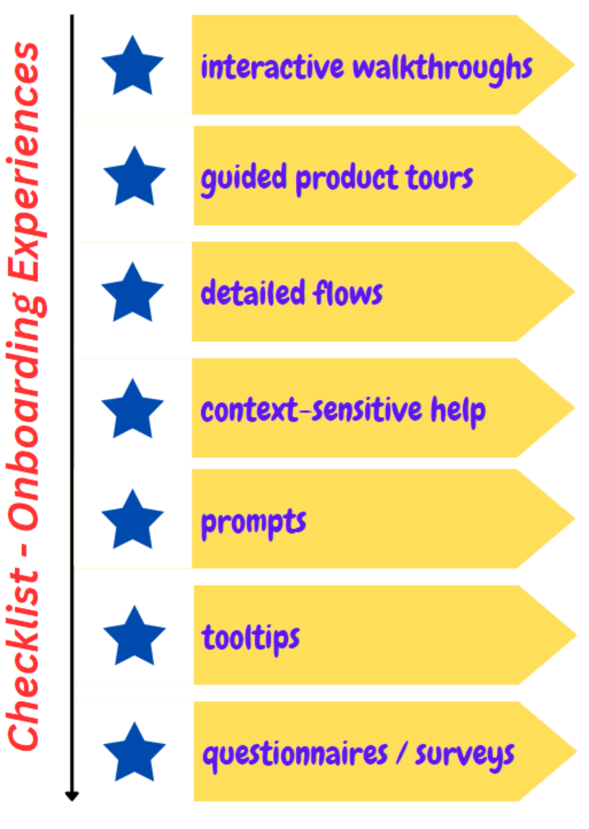
When it is great to have an user onboarding strategy it falls short somewhere as CHURN could still impede & hamper growth.
Here's a thought arching towards making onboarding sustainable.
You can read more about it here: - mgmtinc.substack.com/p/guide-to-make-user-onboarding-more
2/n
Let's now straightaway dive in & explore the user onboarding experiences.
1. Interactive walkthroughs
Ever used an App & felt lost on how to start off / go about a particular task?
You aren't alone.
That's where interactive walkthroughs do fit in really well.
3/n
For ex: remember the first time you got onto @SlackHQ how everything about the layout was fed to you?
Also, remember how there were continuous pop-ups describing each element on the UI.
Some apps have a toggle switch to shut these off to not annoy the experienced users.
4/n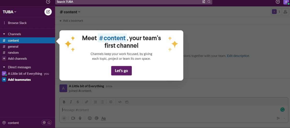
2. Guided product tours
You can't generalize the experience of the users as it could be so diverse, also working with averages could lead to mismatches & eventually fall-outs.
Fully guided product tours make total sense as it could be descriptive enough for all users.
5/n
When guided tours could swell in size, it is a really good ploy to break it all down & build those really short snippets explaining each section / feature of the product / module.
For ex: @twilio showing how to switch menus in this snippet.
twilio-cms-prod.s3.amazonaws.com/documents/SwitchingMenus.mp4
6/n
3. Context-sensitive help
This is perhaps the oldest of the lot.
Being stuck with some element of the UI / not knowing how to go about achieving & needing some quick fix or help is something everyone correlates to.
Remember Clippy by @Microsoft @Office?
7/n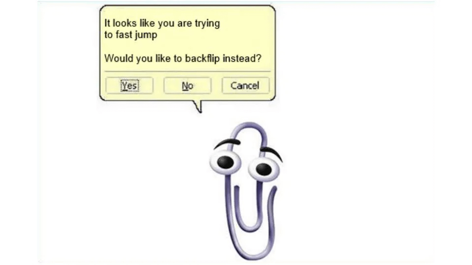
4. Tooltips
A short message that harmlessly pops-up on the side or at the exact site of the problem within say a 15p x 15p area could be a life-saver for most users.
Even better is how the Tooltips have evolved over the years to enforce action via embedded CTAs.
8/n
For ex: @MiroHQ
Be it the tooltip that is instructing you to press your mouse for a prolonged period to unlock the UI element & carry on working
(or)
the navigation around the screen with the right-mouse-button which could be tricky for a newbie
are great examples
9/n
5. Detailed flows
If the product has many steps giving the impression that it is complicated to work with, a detailed flow ought to be mandatory to build & deploy so as to send out a strong message on these lines:
➡problem?
➡we heard you already
➡here, check this out
10/n
For ex: @figma
Using prototyping & depicting interactive flows users would have with the App along with transitions could be complicated for beginners.
Detailed flows explaining the right usage to derive the best value is a great ploy.
Like so:
youtube.com/watch?v=-d6zNGeF59M
11/n
6. Prompts
Arching into habits of collecting feedback, be it generic / totally specific to a workflow to gauge:
➡ elements of design
➡ relevance
➡ ease of use
➡ user experience &
➡ satisfaction
are welcome provided they're used sparingly & at the right time too.
12/n
For ex: popping questions like:
🔹"how satisfied are you with the way you went about accomplishing your task over the app"?
or just a plain & simple
🔹"please rate your experience"
Here's a thread describing the effective use of prompts:
twitter.com/BgpInv/status/1634081179262681088?s=20
13/n
7. Questionnaires / Surveys
When the need to talk 1:1 with users running over those moderated sessions to understand their choices in depth can't be discounted, the need to embed questionnaires & surveys could become imperative at times over some situations.
14/n
When prompts in essence capture highly specific info targeting one variable contributing to UX, questionnaires & surveys delve deeper capturing info over multiple variables / to get a hang of intricate nuances of choices around one specific variable.
For ex: these 3 steps
15/n
Acquisition & activation could follow once marketing strikes a right chord with content targeting the right persona.
The worst that can happen post that is to lose out on your user base owing to bad experiences.
So, user onboarding deserves some really serious thought.
16/n
That's it folks!
For more write-ups about product concepts, mental models, case studies:
➡️ sign-up to my newsletter (1K+ readers)
mgmtinc.substack.com
Also:
➡️ RT the first tweet marked "1/n"
➡️ Follow me on @bgpinv for all things related to product

Guru Prasad “TPW - The Product Web 🕸”
@BgpInv
Product Management (Fintech, B2B B2C SaaS PaaS); Leadership; Coined Solution State Model (SSM)-2014, Elevated Trapdoor-2014; Mentor & Advisor @ TPW;