LinkedIn Text Formatter
Format your LinkedIn posts with bold, italic, underline and more font styles. Copy and paste in seconds.

Alex Morgan
Growth @ Typefully
12h·


253


Write, schedule and collaborate on your LinkedIn content
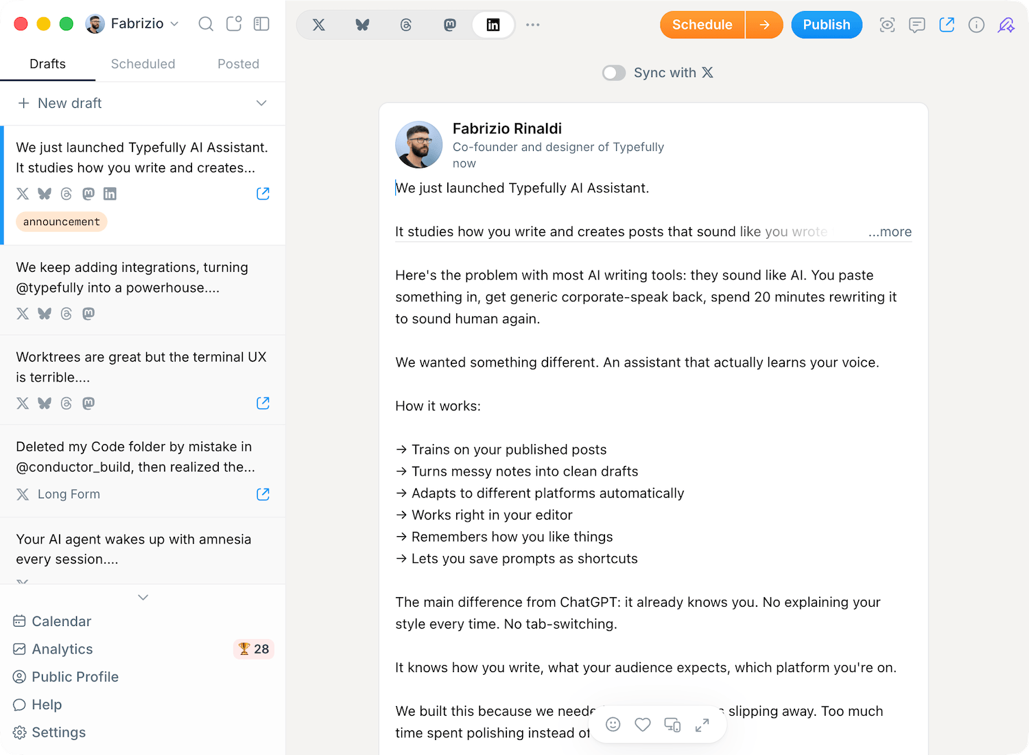
Format your posts, schedule a week ahead and collaborate with your team, all in one editor. Built for people who grow their personal brand on LinkedIn.
Join 10,000+ creators growing on LinkedIn










How to format text for LinkedIn
LinkedIn has no built-in formatting, so styled posts are created with a font generator like this one. Type your text, pick a style, and paste it back into LinkedIn. No account or download needed.
Type or paste your text
Write your post in the box at the top of the page. The LinkedIn preview updates as you type, so you can see how it reads in-feed before you style a single word.
What to check
Check the preview reads well before you style anything.
Pick a style
Select text in the editor and tap bold, italic, underline or strikethrough. Use the style grid below as a preview for decorative Unicode looks like script, gothic, monospace and double-struck.
What to check
Keep bold and italic for emphasis; go easy on the decorative fonts.
Copy and paste into LinkedIn
Hit copy, then paste straight into your LinkedIn post, comment, headline or About section. The styled text carries over because it is made of standard Unicode characters.
What to check
Paste into a real post to confirm every character renders on your device.
Why format your LinkedIn posts at all?
Formatting is not decoration for its own sake. Used well, it changes how many people stop, read, and remember your post.
Stop the scroll
The LinkedIn feed is a wall of plain text. A bold first line or a styled accent breaks that pattern, so your post catches the eye instead of blending in.
Earn more engagement
People skim before they commit. Posts that are easy to scan hold attention for longer, and attention is what turns into likes, comments and reposts.
Make your point land
Bold the one stat that matters. Italicise the line you want quoted. Formatting points the reader at your key idea so it does not get lost in the middle of a paragraph.
Look more considered
A tidy, well-structured post signals that you put thought into it. That small bit of polish builds credibility with the people you most want reading your work.
How does LinkedIn text formatting actually work?
LinkedIn does not support bold, italic or other rich text in posts. A font generator gets around this with Unicode.
Every character you type has a code point in Unicode, the universal standard behind almost all digital text. Beyond the normal alphabet, Unicode also contains complete sets of look-alike letters (mathematical bold, italic, script, gothic, monospace and more) that were originally added for maths and scientific notation.
This tool swaps each letter you write for its styled twin from one of those sets. So when you "bold" a word, you are not applying formatting the way you would in a document. You are swapping the letters for different characters that happen to look bold. LinkedIn treats them as plain text, which is exactly why they survive the copy and paste and show up styled in your post.
Because these are real characters and not formatting, the same styled text works anywhere that accepts Unicode: LinkedIn posts and comments, your profile headline and About section, and other platforms like X, Threads, Instagram and Facebook.
LinkedIn font styles at a glance
Use the editor above for bold, italic, underline and strikethrough formatting. This library previews extra Unicode styles like script, gothic, monospace and double-struck so you can choose accents that still look right on LinkedIn.
Bold is the most requested style, and the safest to reach for. A bold first line is a clean way to make your hook stand out. Italic works well for quotes, asides and emphasis, while strikethrough is handy for a before-and-after or a deliberate "not this, but this" effect. Underline draws the eye to a single key phrase.
The decorative fonts (script, gothic, monospace and double-struck) are eye-catching but harder to read, so they suit a name, a logo-style line or the occasional accent rather than the body of a post.
Where you can use formatted text
Styled text is plain Unicode, so it works in any LinkedIn field that accepts typing, and on most other social platforms too.
Post hooks
Bold the first line of a post so it stops the scroll. This is the highest-impact place to use formatting, because it is the part most people actually read.
Your headline
Add a styled accent to your profile headline so it reads differently from everyone else's. Keep it light, since recruiters and search both still need to parse it.
About section
Use bold subheadings to break a long About summary into scannable chunks instead of one dense wall of text.
Comments
Emphasise a key phrase when you comment on someone's post. A little formatting helps your reply stand out in a busy thread.
Company pages
Formatted text works on company page posts too, so your brand updates can use the same hooks and structure as personal ones.
Other platforms
The same copied text works on X, Threads, Instagram and Facebook, because it is plain Unicode rather than LinkedIn-specific formatting.
How to format LinkedIn posts that get read
Formatting helps when it guides the reader and hurts when it shouts. These habits keep your posts looking sharp rather than spammy.
Format a few words, not whole posts
Styling is contrast. Bold one line and it pops; bold everything and nothing stands out. Reach for it on hooks and key phrases, then leave the rest plain.
Lead with a bold hook
The first line decides whether anyone reads the rest. A short, bold opening earns the tap past the “more…” cutoff better than a styled wall of text.
Use white space to set the pace
Formatting and line breaks do different jobs. One idea per line with blank lines between them is what actually makes a post easy to scan in the feed.
Skip fancy fonts for the body
Script, gothic and double-struck look great in a name or accent line but slow readers down in a paragraph. Keep the body in normal or bold text.
Before you use it: what formatted text can't do
Unicode formatting is a clever workaround, not a real feature, so it comes with a few trade-offs. We would rather you know them up front than find out in the comments.
It is not searchable
LinkedIn search and hashtags read normal letters, not Unicode look-alikes. A bold or script keyword in your headline or post will not be matched, so keep anything you want found in plain text.
Screen readers struggle with it
Assistive tech often reads styled characters out one by one, or skips them entirely. Heavily formatted text can be unusable for people who rely on screen readers, so use it sparingly and never for your whole message.
It can render differently across devices
Most modern phones and browsers show these characters fine, but older or unusual setups may display empty boxes for some fonts. Decorative styles are the most likely to break.
It uses more of your character limit
Several styled letters take up more than one character behind the scenes, so a formatted line eats into LinkedIn's 3,000-character post limit faster than it looks.
Frequently Asked Questions
How do I make text bold on LinkedIn?
LinkedIn has no bold button, so you use a font generator. Type your text above, select it, tap the bold style, then copy and paste the result into your post, comment, headline or About section.
How does a LinkedIn font generator work?
It swaps each letter for a look-alike character from Unicode (the standard behind all digital text) that happens to look bold, italic or styled. LinkedIn treats those characters as plain text, so the styling survives copy and paste.
Is this LinkedIn font generator free?
Yes. The team at Typefully built this tool to be used completely for free, with no account, login or download required.
What text styles can I generate?
Bold, italic, underline and strikethrough are available in the editor. The style library below also previews decorative Unicode font styles like script, gothic, double-struck and monospace so you can see how those characters render on LinkedIn.
Does formatted text hurt my reach or searchability?
Styled characters are not read by LinkedIn search or hashtags, so anything you want found should stay in plain text. Formatting itself does not reduce reach, but replacing a searchable keyword with a styled version means it will not be matched.
Is formatted LinkedIn text accessible?
Not fully. Screen readers often read styled characters one by one or skip them, which makes heavily formatted text hard to use for people who rely on assistive tech. Format a few words for emphasis rather than your whole message.
Will the formatting show up on mobile?
On most modern phones and browsers, yes. Some older or unusual devices may show empty boxes for the more decorative fonts, so plain bold and italic are the safest choices when you want it to render everywhere.
Why does my formatted text look like empty boxes?
A box means the device does not have a glyph for that Unicode character. It usually happens with decorative styles on older systems. Switch to a simpler style like bold or italic and it will display correctly.
Does it work on X, Instagram and other platforms?
Yes. Because the output is standard Unicode rather than LinkedIn-specific formatting, the same copied text works on X, Threads, Instagram, Facebook and most other platforms.
Can I see how my post will look before I publish?
Yes. The preview on this page shows your post as it appears in the LinkedIn feed. For a closer look at the "more…" cutoff on desktop and mobile, use our LinkedIn Post Preview tool, and to draft from scratch try the AI LinkedIn Post Generator.
Can I schedule or publish the styled post?
This page is for formatting and copying. When you are ready to schedule a first comment, publish, or collaborate with your team, open it in Typefully.
Ready to grow your personal brand on LinkedIn faster?
Join 10,000+ customers