
Throw out the correlation matrix and use bar charts to visualize correlation❗ 📊
🧵
❓ What is the issue with the correlation matrix?
Even if you use great diverging color palettes, it can be hard to find the correlation pairs with the highest and lowest values
On the other hand, if you use bar charts, those values will jump off the screen.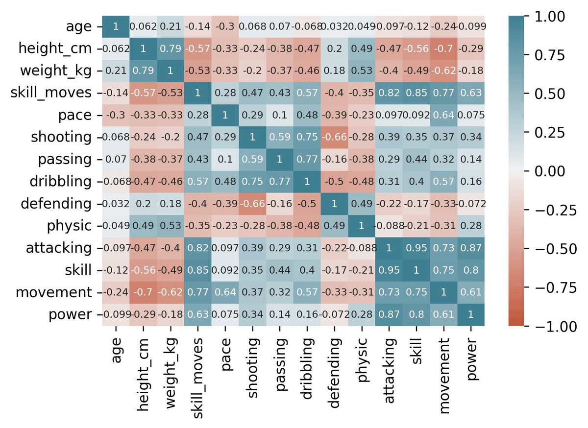
To create the bar chart we will need to define 2 functions
1. To remove duplicates
2. To create the pairs we can visualize
I took codes from this article:
stackoverflow.com/questions/17778394/list-highest-correlation-pairs-from-a-large-correlation-matrix-in-pandas
We will use some columns of the Fifa 22 players dataset for this example from Kaggle.
The output of the below code will be a series object with pairs of variables and the correlation coefficient.
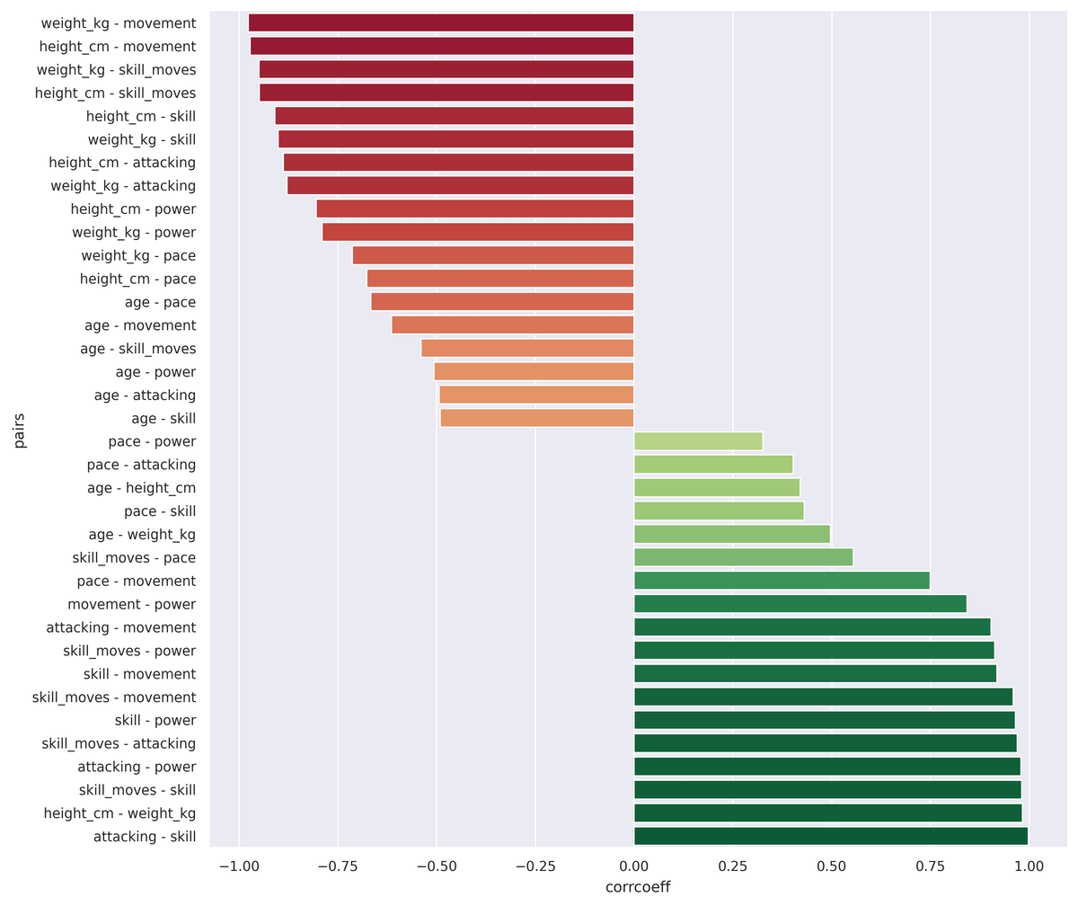
Now if we set figsize and add .plot.barh() to visualize the resulting series object we will get this ⤵️
Already looking good, but we can still improve with some colors.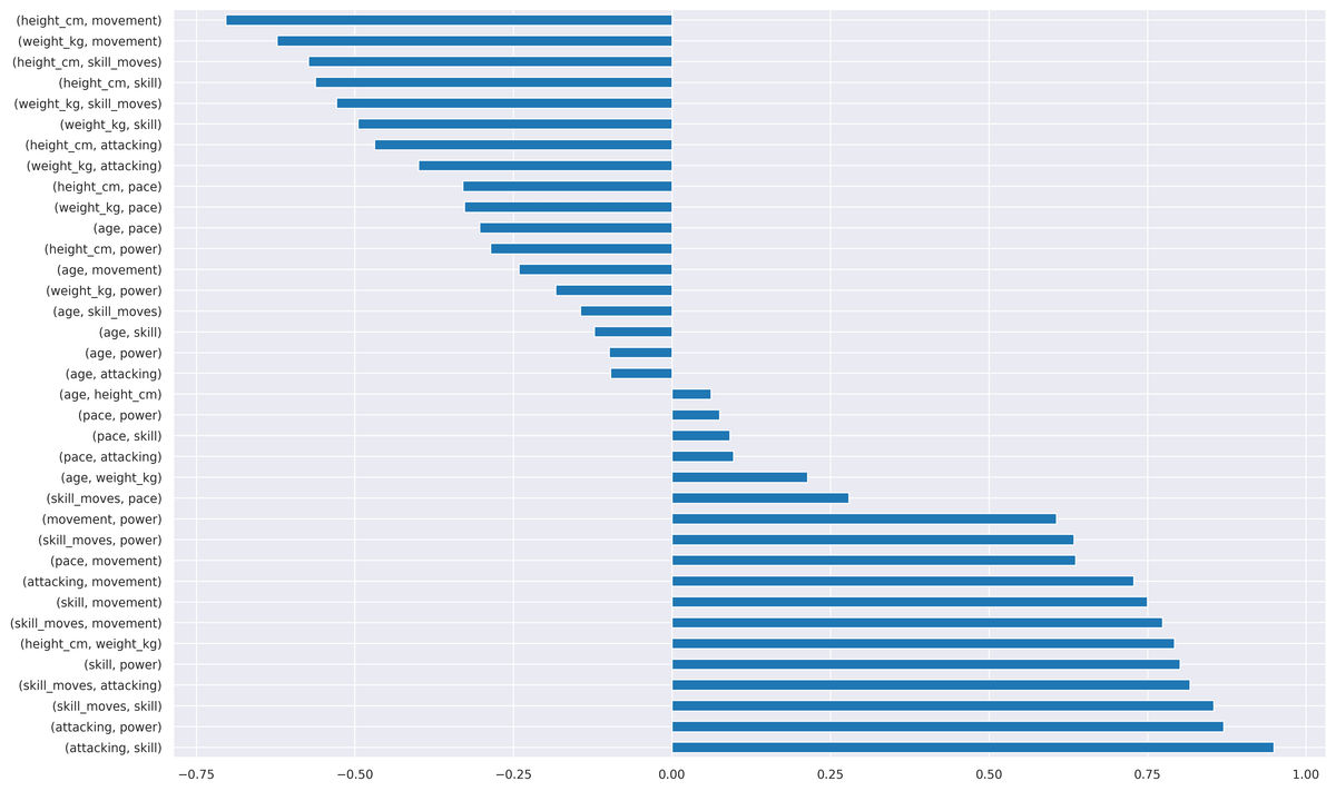
Here is the final code and the resulting bar chart.
This way you can easily find the highest negative and positive correlations.
Also, the values are easily comparable.