Came across a health design contest I entered in 2012 and couldn't believe the site was still up! 💡Ideas I still think are good: This is the Health Matrix, patient clicks on diseases or drugs or doctors and it shows them how they're all related and their importance (square size)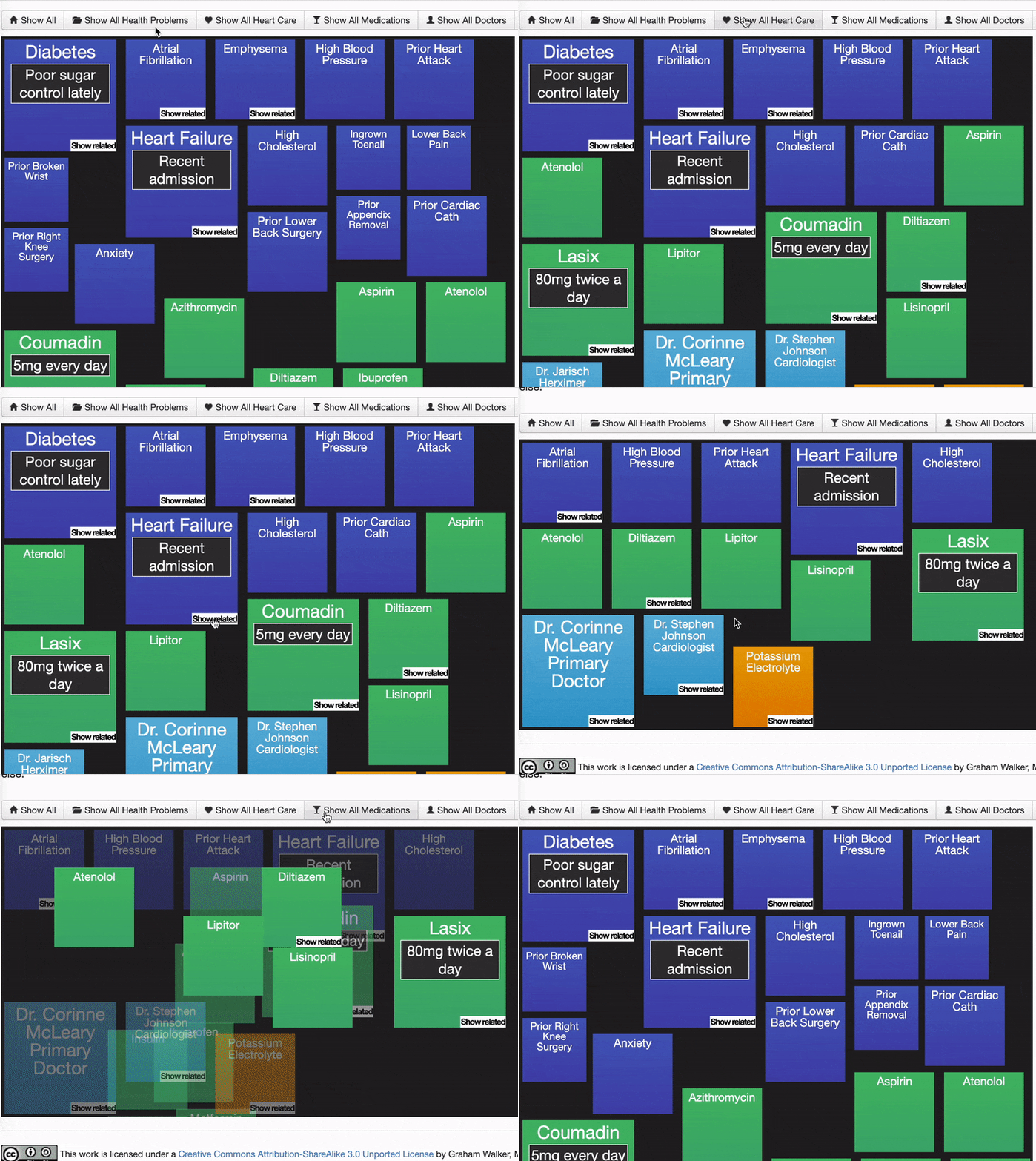
Many patients don't know their meds, so this med list includes photos of the pills, why they take them, which body system, and the sig: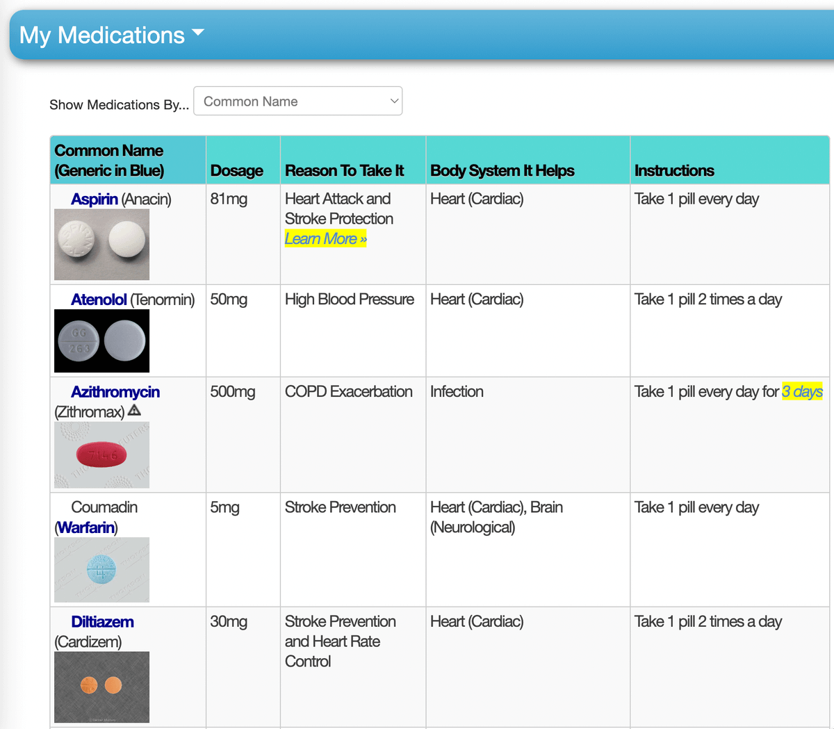
Schedule view! When to take what, and how much to take!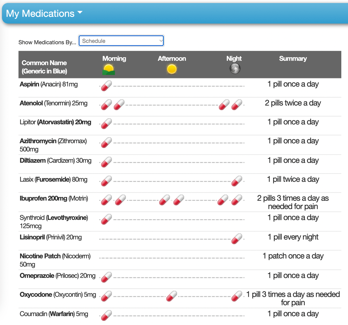
Most recently prescribed, including short-term meds like antibiotics and when they should finish the course. Also highlights changes in doses/sig.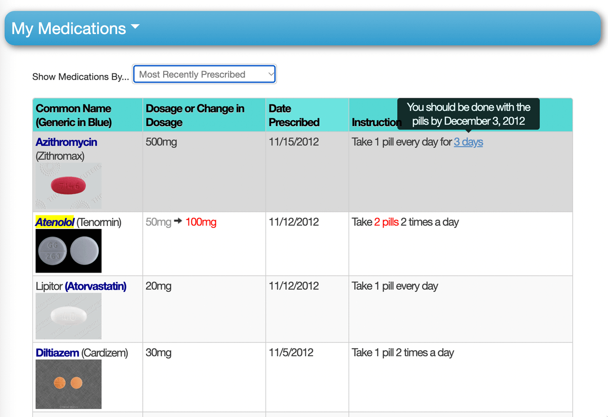
List of health problems, including 1️⃣ "what I can do about this" and 2️⃣ "what causes this"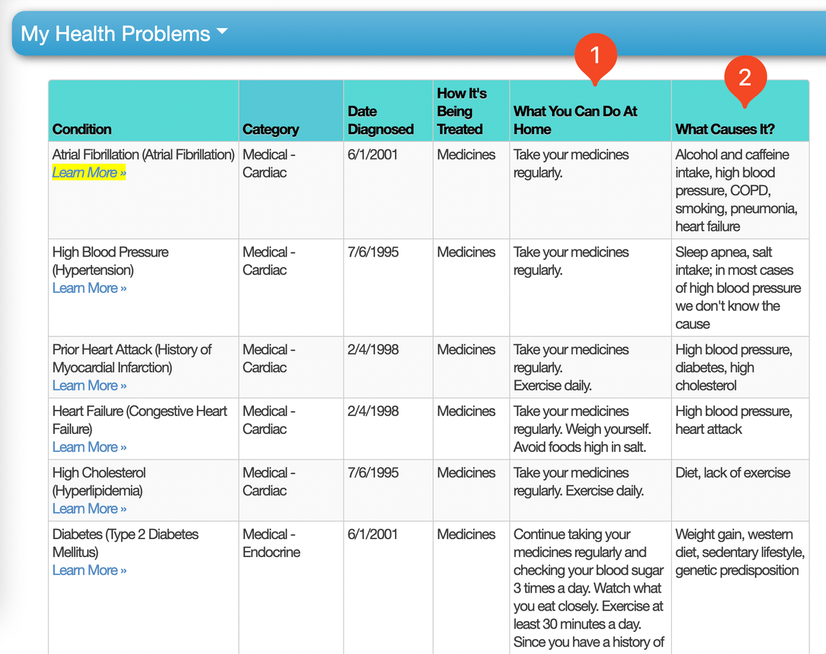
A written summary in plain English of the patient's most recent lab results, including alerts for things that are abnormal and can be dangerous.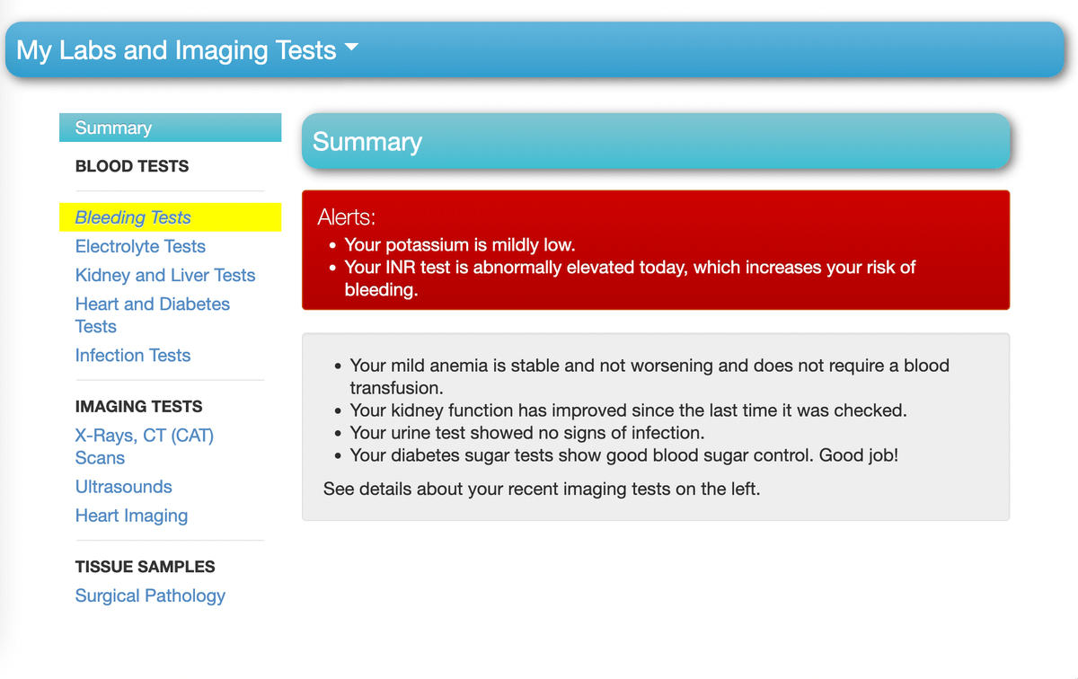
Note the labs are grouped by "Bleeding" or "Electrolytes" or "Kidney and Liver" not by the damn lab test we ordered, like a Chem7 or CBC!
Also: visual, relative lab values (with the option to hover to see the actual values)!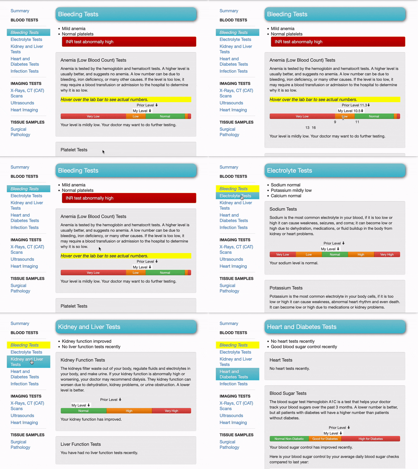
And, of course, a "doctor view" which goes into more detail, has diagnoses in "medical-ese," and trends labs. (This is the one thing I'm okay with now — table-view of labs, and no more of these cryptic fishbone diagrams.)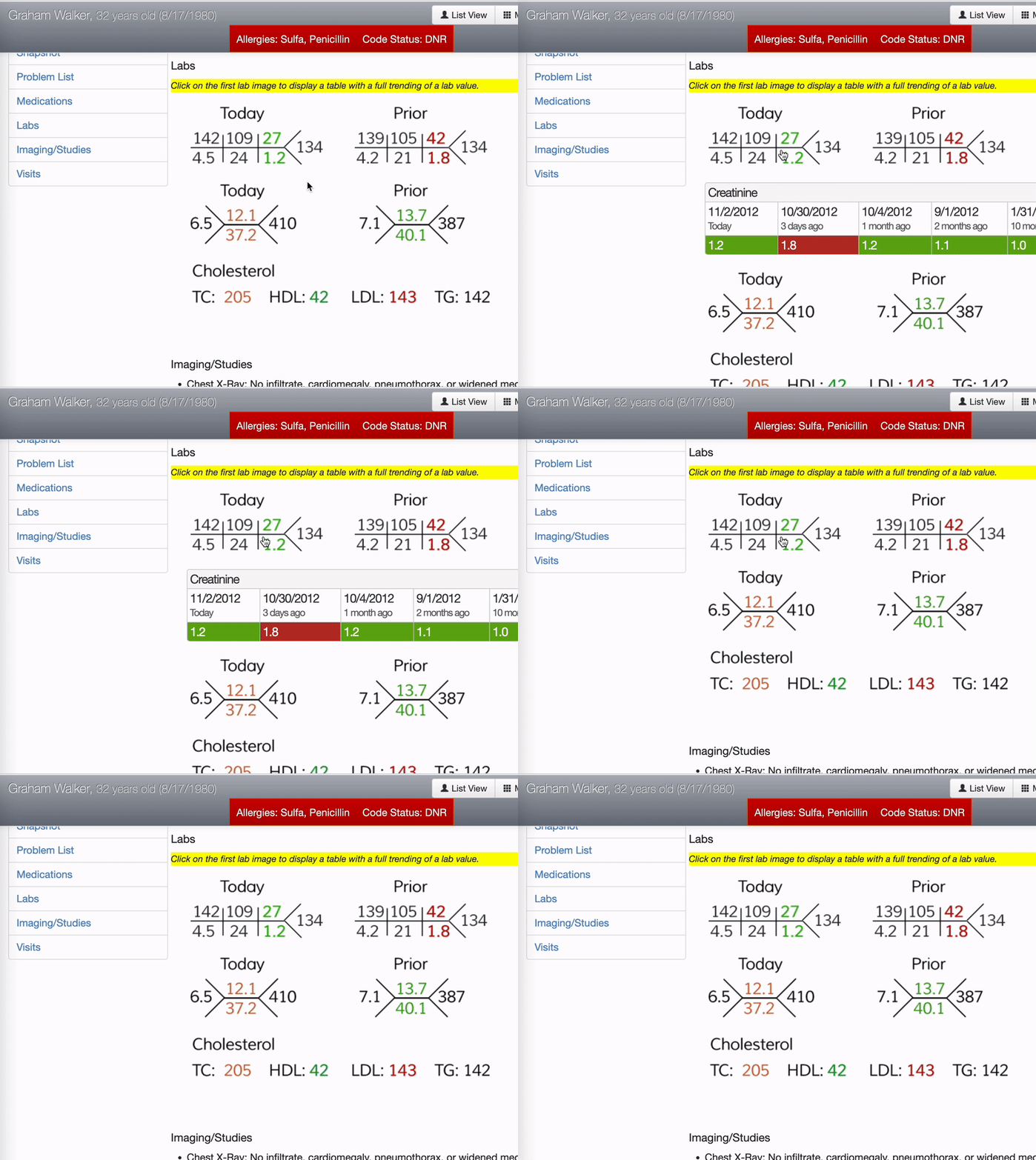
Did anyone else submit a design? This was a design challenge to redesign the CCD (Continuity of Care Document). Would love to see what others are doing now! (Sadly, I don't think any of these designs actually made it into a CCD). @devpost @ONC_HealthIT
healthdesign.devpost.com/
My site is still up somehow! healthee.site44.com/ @nickgenes @cddirks @Health_IT @mshlcurrie @RAdamsDudleyMD @emlitofnote @dirkstanley @MattSakumoto @RobPNorris