🔷 About HTML Units
A Thread🧵 👇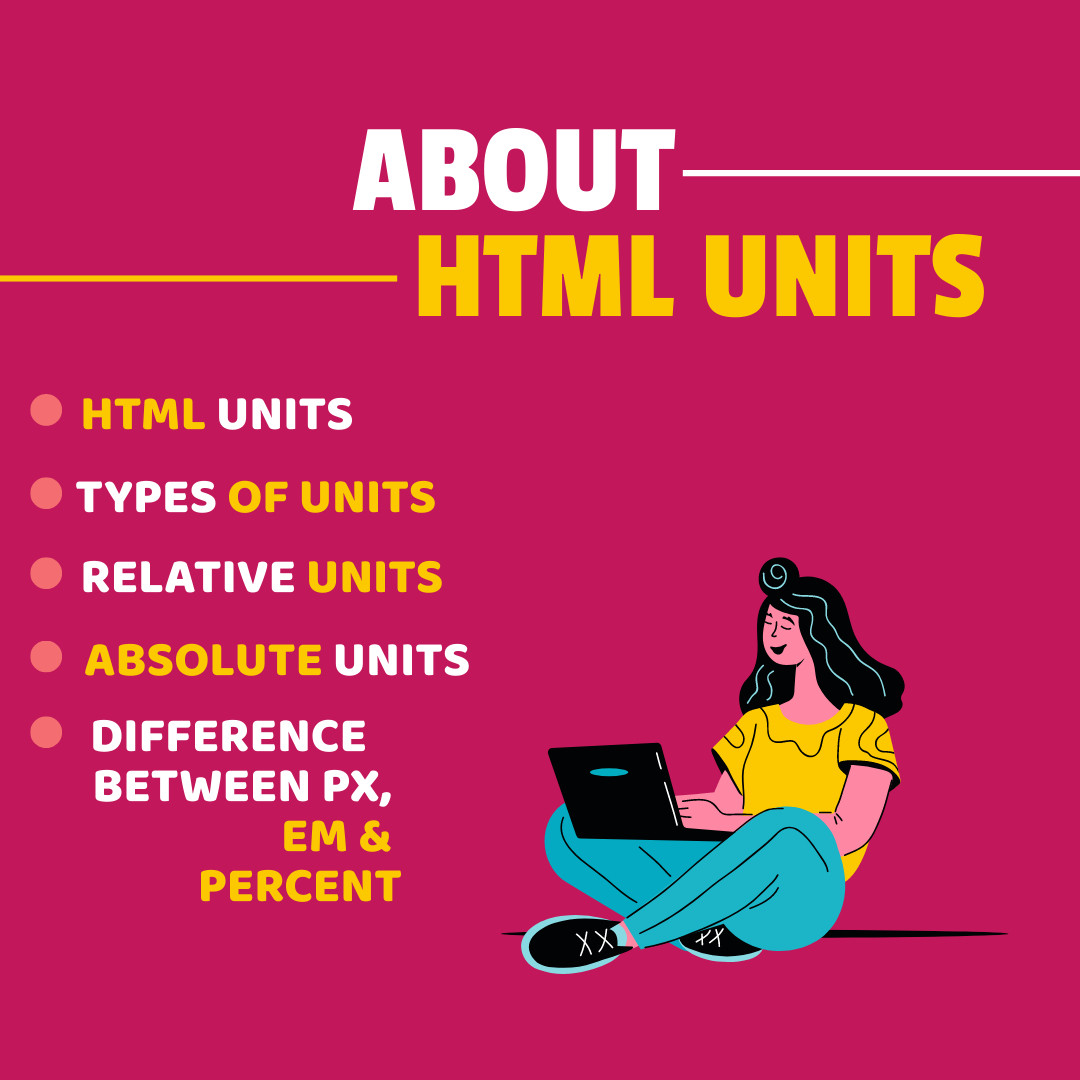
📌 HTML Units
→ CSS has several different units for expressing a length.
→ Many CSS properties take "length" values, such as width, margin, padding, font-size, etc.
→ Length is a number followed by a length unit, such as 10px, 2em, etc.
→ A whitespace cannot appear between the number and the unit.
→ However, if the value is 0, the unit can be omitted.
→ For some CSS properties, negative lengths are allowed.
📌 Types Of Units
→ There are two types of length units:
1️⃣ Relative Units
→ em, vh, ex, ch, rem, vh, vmin, vmax, %
2️⃣ Absolute Units
→ px, pt, pc, mm, cm, in
1️⃣ Relative Units
→ Relative length units specify a length relative to another length property.
→ Relative length units scale better between different rendering medium.
2️⃣ Absolute Units
→ The absolute length units are fixed and a length expressed in any of these will appear as exactly that size.
→ Absolute length units are not recommended for use on screen, because screen sizes vary so much.
→ However, they can be used if the output medium is known, such as for print layout.
→ Pixels (px) are relative to the viewing device.
→ For low-dpi devices, 1px is one device pixel (dot) of the display.
→ For printers and high resolution screens 1px implies multiple device pixels.
📌 Difference Between PX, EM and Percent
→ Pixel is a static measurement, while percent and EM are relative measurements.
→ The size of an EM or percent depends on its parent.
→ If the text size of body is 16 pixels, then 150% or 1.5 EM will be 24 pixels (1.5 * 16).
Thanks for reading this thread ❤️
If you like it , make sure you:
🔷 Like the tweet
🔷 Retweet the first tweet ⚡
For more content , follow:
@MrunayU

Mrunay Uttarwar
@MrunayU
🌐 Front End Dev 💻 Transitioning into Web3 🚀 Content Creator 📝 Always learning and sharing my journey 💻 Let's connect and geek out!