I visited the Dropbox website for the first time in a while and have some thoughts on how it could be improved 👇🏻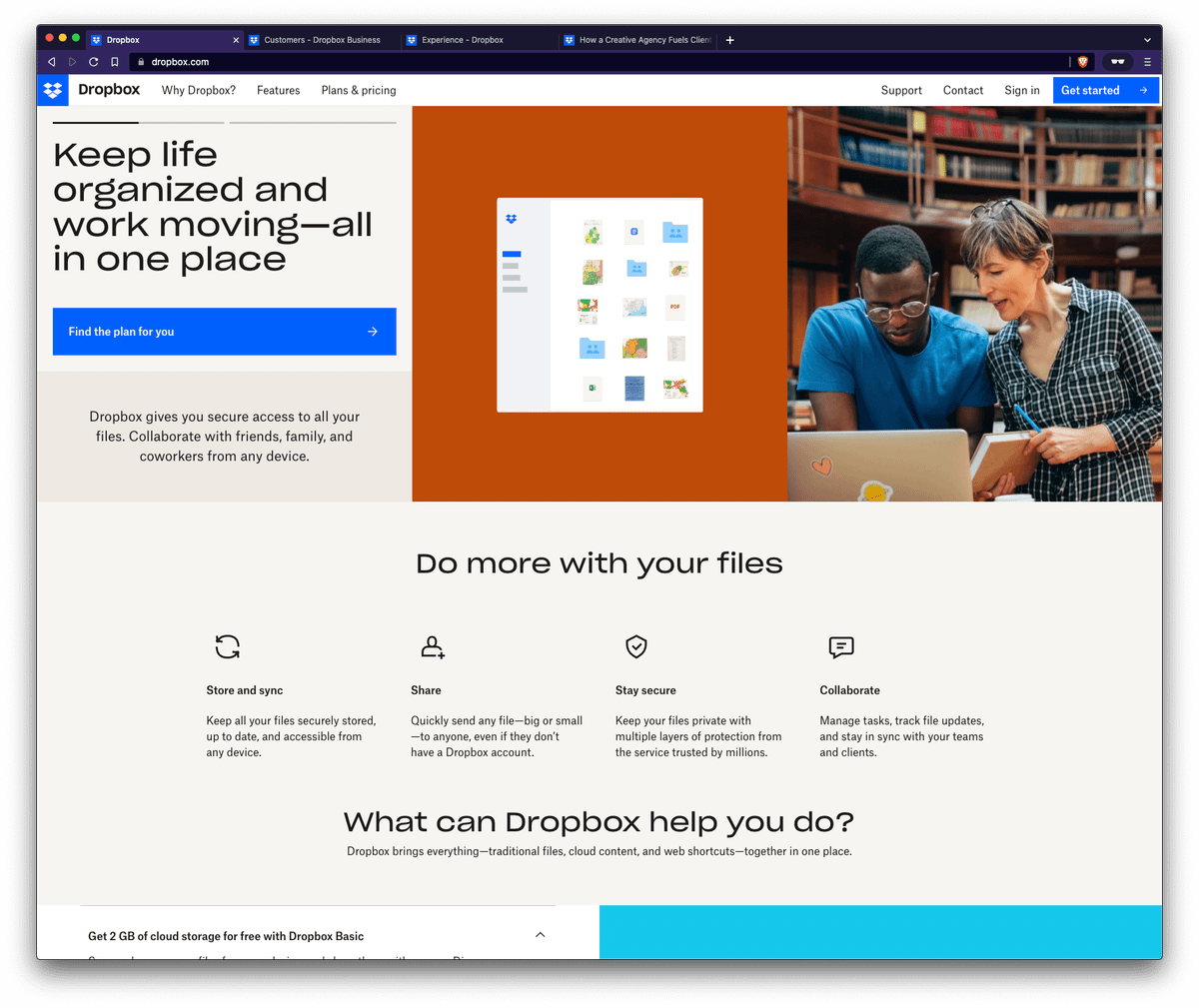
There's an a11y quirk with the global navigation design where all links have the same cursor when hovering over them, regardless of what action you can take.
It confuses me that clicking "Features" toggles a dropdown instead of taking me to a specific "Features" page.
The Dropbox homepage feels very suffocated. On a 49" ultrawide nothing feels like it has space to breathe.
I'm not implying everything has to float in negative space, but I think affordance could be provided to improve clarity.
But then more content would be "below the fold" 🤦🏻♂️
Speaking of suffocated, check out the hover state for these cards 😶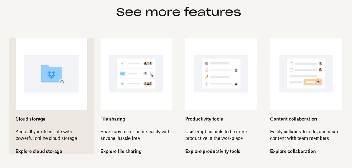
I also feel like the messaging for Dropbox could better tell coherent stories for use-cases that potential customers might have—individuals and businesses alike.
My eyes glaze over trying to read the copy.
1. What problem(s) do I experience as a Google Drive user that Dropbox solves?
2. What problem(s) do I experience if I've never used cloud storage that Dropbox solves?
3. What problem(s) does my business experience if we fall into points 1 or 2?
It's not all bad, though! I like the Dropbox Experience landing page and inner pages 👏🏻
You can read the unrolled version of this thread here: typefully.com/KeenanPayne_/6NZUwAH

Keenan Payne
@KeenanPayne_
Hey, I'm Keenan 👋🏻 By trade, I'm a freelance web developer with over 13 years of experience. I specialize in building complex UIs. I'm always learning, sharing, and creating. Here, you'll find some self-selected highlights from what I've written on Twitter so you don't have to scroll through my mess of a timeline. Have fun ✌️