If you're excited to test out APCA, I've got good news:
I put together an APCA plugin for Figma.🎉
figma.com/community/plugin/806578669827234193/zebra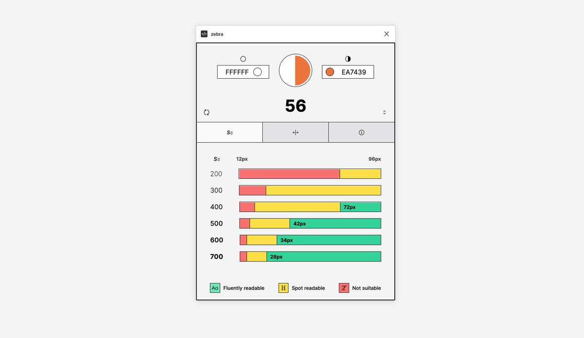
The first tab shows the minimum recommended font sizes for each font weight.
The second tab compares the APCA contrast level to the WCAG score so you can get a good sense of how they compare.
The third tab explains what each APCA level means in a bit more detail.
You can change the input colors manually using the text inputs or you can use selection mode.
Remember, with APCA, the position of a color (foreground, background) affects the contrast
A couple of warnings:
1) - 🚧 APCA is still being evaluated and some things might change between versions.
2) - ⚠️WCAG 2 is still lord, bla bla bla.
3) - ⚠️ The spot readable text ranges are calculated a bit naively right now. That will change in an update but use with caution.
The fluent text ranges are solid though.
3) - ℹ️ The font sizes assume a reference font of Helvetica or Arial with an x-height ratio of at least 0.52.
If your font uses a dramatically different x-height these ranges won't be accurate.
Larger x-height ratio is better for readability.
5) -👆this should have been 4)

Dan Hollick
@DanHollick
design engineer @tailwindcss. writing a book about software at makingsoftware.com prev: @raycastapp