Why are some typefaces harder to read than others at the same font-size?
Well, it has a lot to do with x-height but of course it's a bit more complicated than that: ↓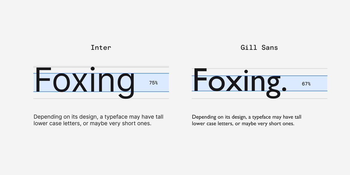
You probably know this already but the x-height of a typeface is the difference between the baseline and the height of the lowercase letters.
We can also think of x-height as a ratio of the total cap height or body height.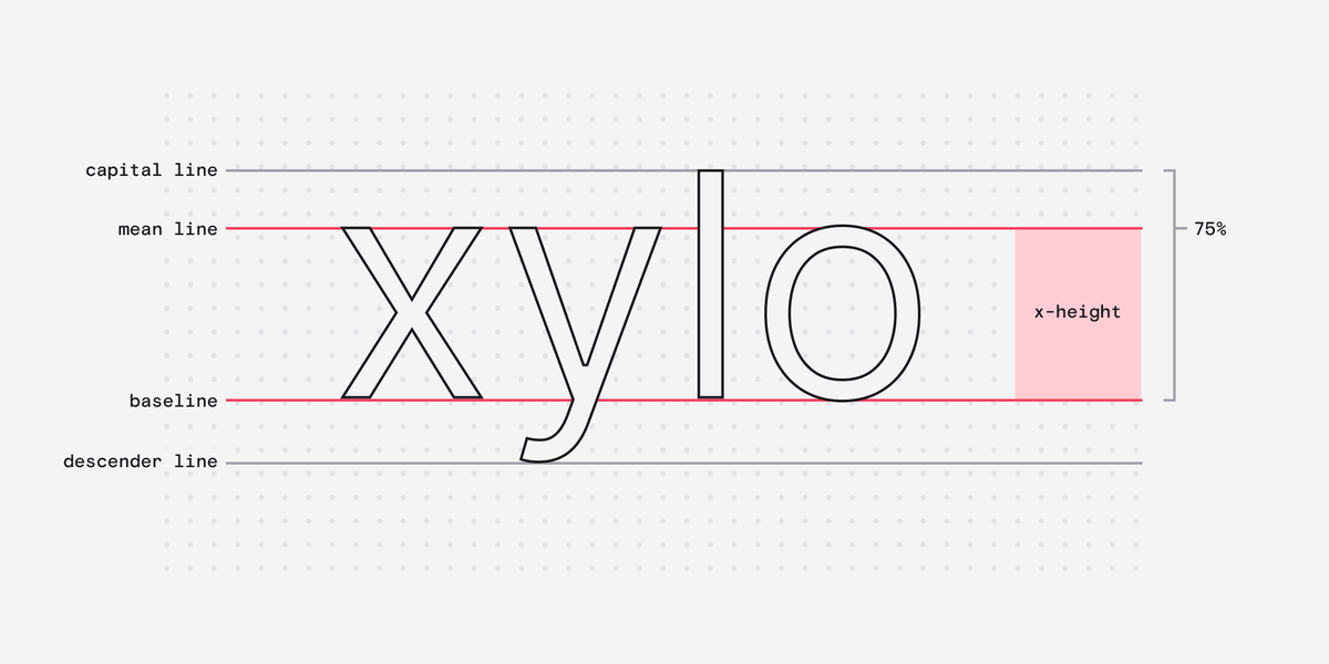
Typically we use the letter x to determine this, hence the name.
Interestingly, curved lowercase letters like a, c, and e are often slightly taller than the x-height. They purposefully overshoot so that they appear the same visual height as x, v, w, and z.
Anyway...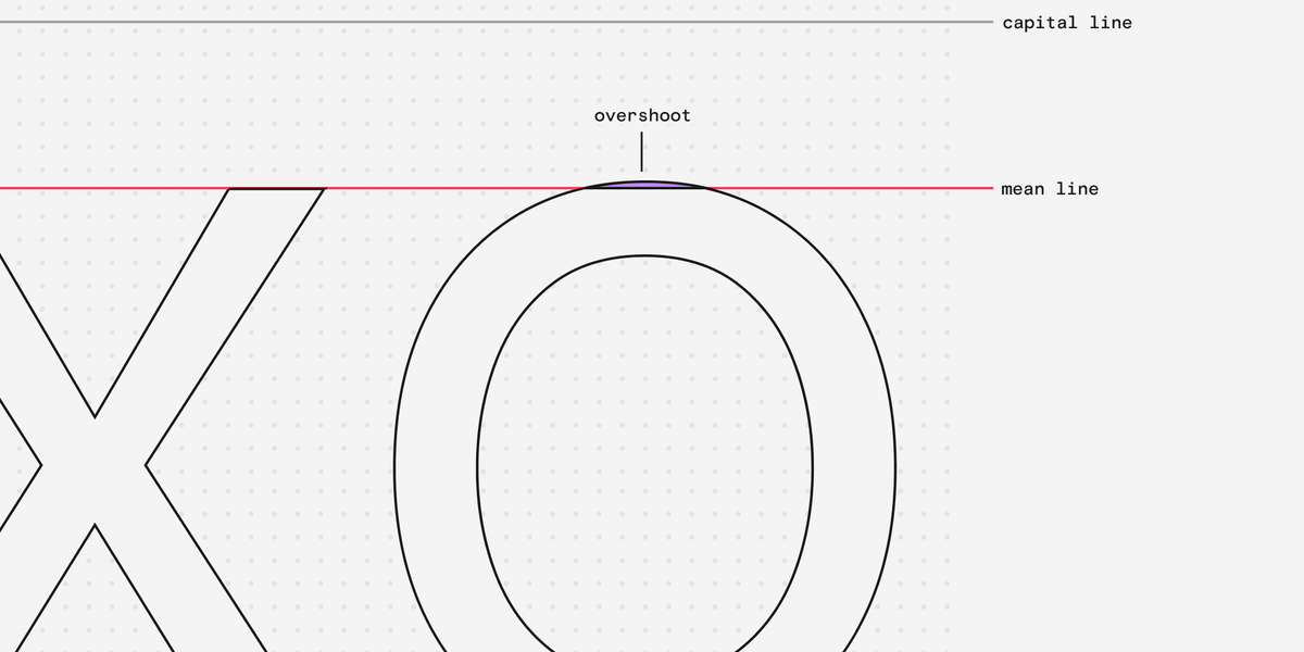
Researchers have studied how x-height impacts reading speed and found that there is an optimal x-height size.
This optimal x-height is around 0.3° of visual arc (i know wtf) after which reading speed begins to decrease.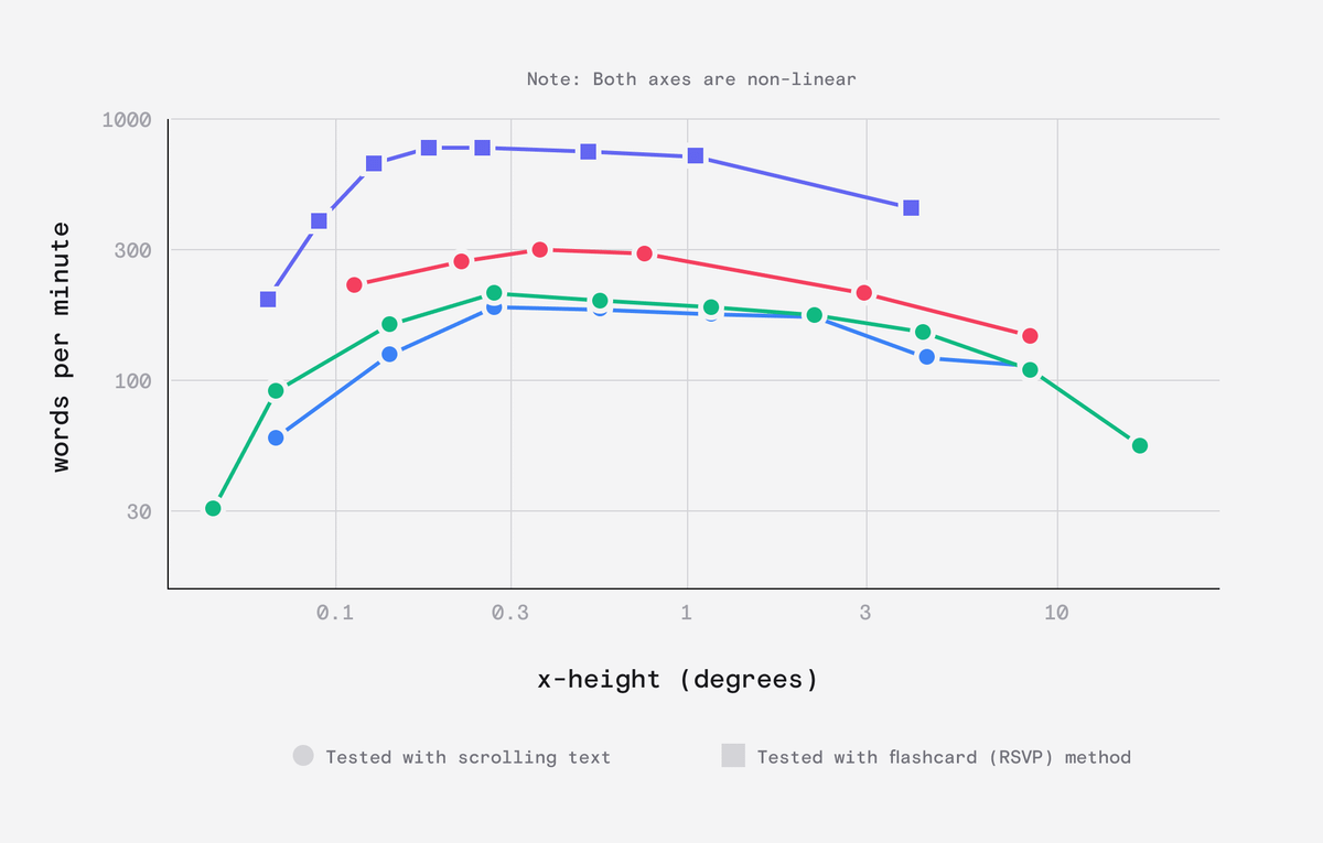
Now what the fuck does arc mean?
Arc is a way of measuring how much of your field of view an object takes up, in degrees.
This depends on both how big *and* how far away something is - removing all the variance caused by pixel size and density.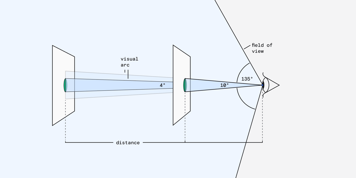
Practically, this means that typefaces with x-heights outside of this optimal rage need to be either larger or closer to have the same legibility as typefaces within this range.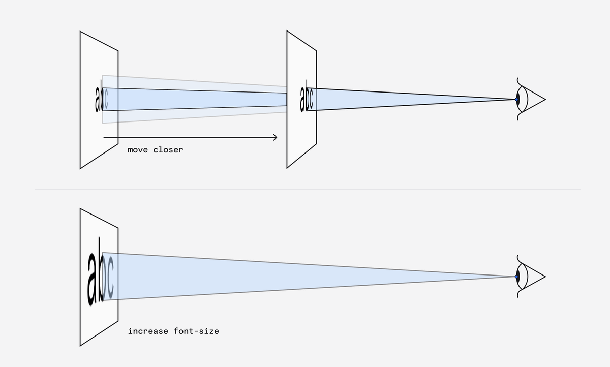
If I assume a viewing distance of 40cm from my LG 4K monitor I can roughly work out the arc size of some typefaces and you can see that they are in the ballpark: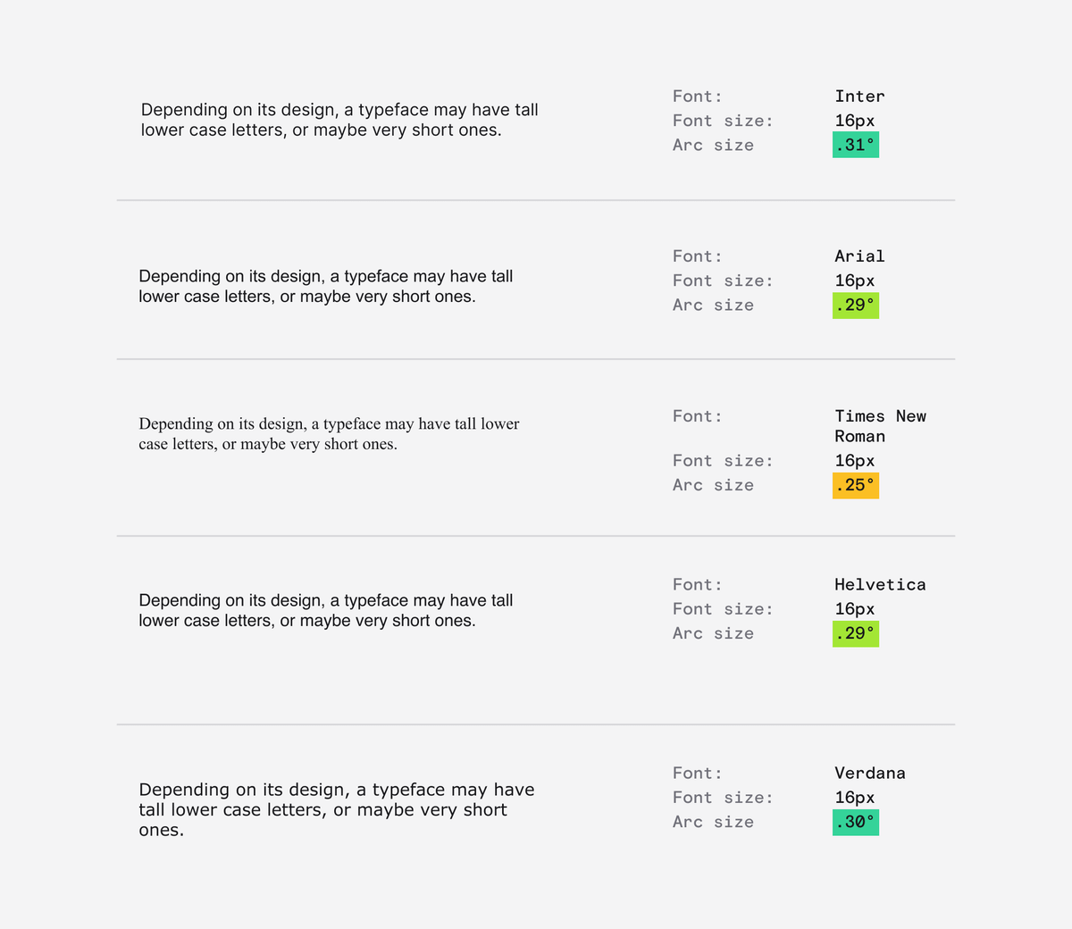
Of course, there is a lot more to legibility than just x-height.
Font-weight and contrast matter as much, if not more but I thought this was an interesting topic.
There is a great article on this here:
imarc.com/blog/best-font-size-for-any-device
And the original paper is a surprisingly gripping read:
jov.arvojournals.org/article.aspx?articleid=2191906
If you want to go down the rabbit-hole of pixel sizing I wrote about that here:
twitter.com/DanHollick/status/1501584351842111488?s=20
I also wrote about font rasterisation, which is kinda unrelated but interesting nonetheless:
twitter.com/DanHollick/status/1441110053818302474

Dan Hollick
@DanHollick
design engineer @tailwindcss. writing a book about software at makingsoftware.com prev: @raycastapp