What really contributes towards a great UX?
Is it:
- the user interface?
- the overall design?
- the way a problem is solved?
Let's try & understand this over a CASE STUDY of a popular product: - "iPhone"
#productmanagement #prodmgmt #UX #empathy #insight #casestudy
1/n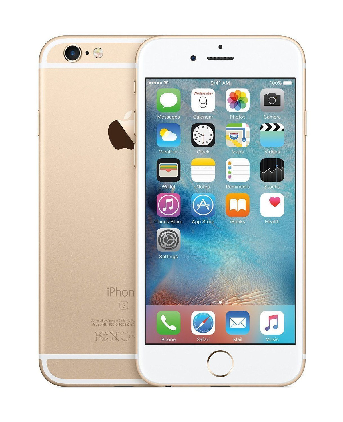
Over my recent article I've covered the theory & mental models users follow in accomplishing tasks while getting to "the elements" that one ought to consider if one is thinking about offering a great UX.
It's called The UX Correlative.
Link here...
mgmtinc.substack.com/p/whose-job-is-ux
2/n
Let's dive right into our CASE STUDY.
There are elements (as quoted in the article) that add up to contributing to a great UX & taking it a full circle.
We're now going to pick each of those components, break them down / work backwards so as to understand their fitment.
3/n
1. Research
When the iPhone took on the market about 16 yrs back, none of them believed that it would entirely revolutionize the space.
But, looking back today the research & the learnings they employed to create the product ought to have put them in the clear.
4/n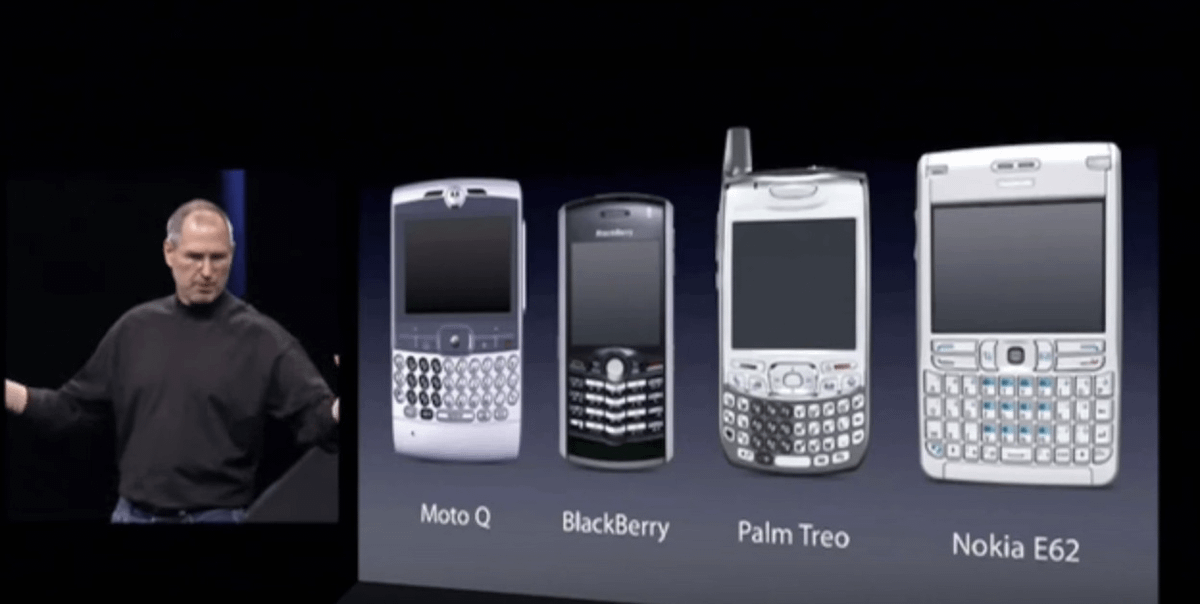
Let's consider a few of those findings from their research & use it as a base:
a) keypads were occupying 50-60% of the screen
b) screen size was very small
c) other functions like AV / Music players
d) overall size of the phone
e) computing power
f) prone to physical damage
5/n
2. Discovery
The research branched into multiple findings, establishing the problem more prominently.
a) wide QWERTY keypads made devices look clumsy spoiling the UX totally
b) when one had to house a big keypad, it obviously meant a shorter screen size
6/n
c) a few failed attempts by others to embed music players
d) the big keypad & a wide screen meant the device width had to increase by an uncomfortable margin
e) lack of computing power meant limited uses for power users
f) devices weren't shockproof
g) device security
7/n
3. Empathy
Employing a brand of user empathy was the right way to get to the depth of understanding problems.
a) when power users needed keypads, they had a tough time typing
b) small screens demanded really sharp eyesight to peer into small characters on screen
8/n
c) Motorola had already failed trying to integrate iTunes
d) many users complained how the phones were getting too wide to even hold comfortably
e) power users needed to run powerful Apps but that ecosystem was yet to evolve
f) overall build quality made devices fragile
9/n
4. Ideation
The ideas generated were all world-class & ahead their time.
a) without stuffing all the options on the keypad, it could be made simpler by polymorphic behavior using function-key overloading
b) can we use the entire device width to double up as a display area
10/n
c) other use cases - music / AV player, iTunes integration (to double up as an iPod & perhaps EOL of the iPod)
d) comfortable device width so as to improve usability across long hours
e) make it a smartphone to allow Apps to be installed
f) sturdy body, unbreakable
11/n
5. Concept
With all that information on hand a concept was coined:
- the touchscreen was introduced to eliminate the permanent keyboard
- single button for bringing the screen On / Off
- disruptive ways towards interacting with the device & the FORM FACTOR was introduced
12/n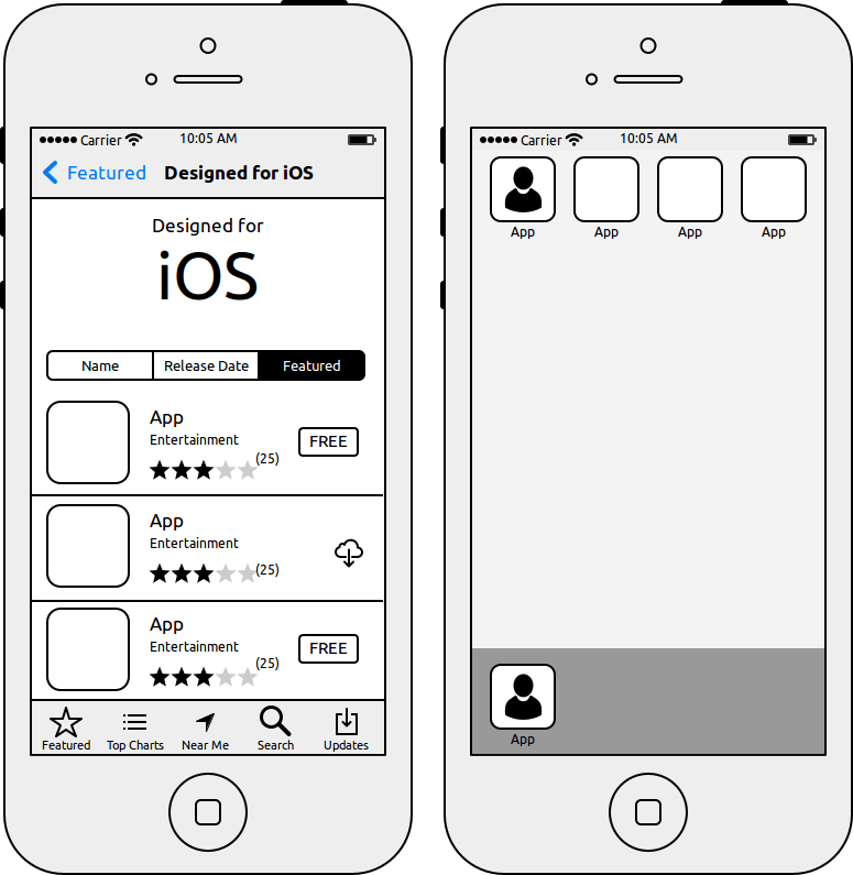
6. Information Architecture (IA)
- the home screen
- one can organize important widgets (weather, calendar)
- some quick access apps (bottom row)
- space for other important apps (main screen area)
13/n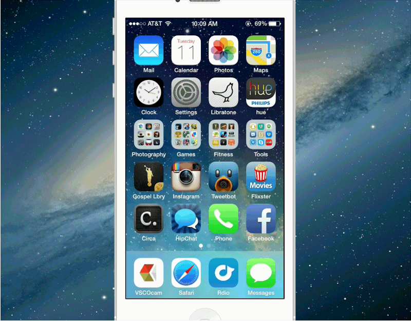
7. Interaction Design (IxD)
- the form factor (this is now a global standard)
- L-R swipe to access other pages
- pull-up / down menus
- toggling between the apps that are open & closing them as needed
14/n
8. Visual Design
Software:
- how the screen looks
- the colors used
- size of the icons, menu etc.
&
Hardware:
- the full body touchscreen
- branding at the back
- sturdy build, shockproof
- fingerprint scanner was a major breakthrough here
15/n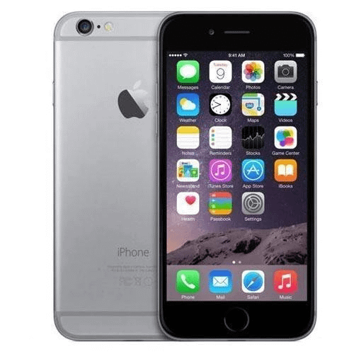
9. UI
The resultant of factoring all that understanding was a "robust UI" that was regressively tested & could function without any lags in prescribed standard environments.
Also, iPhone 6 had:
- 1GB RAM
- 16-128GB disk-space
- unlimited functionality (best for its time)
16/n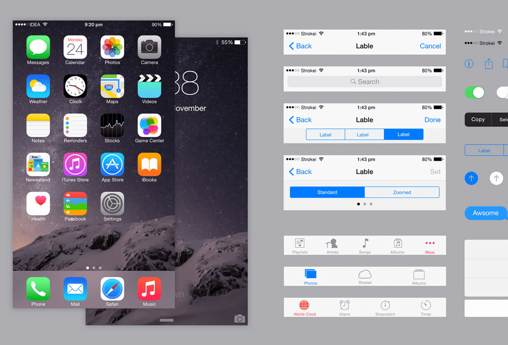
That's it folks!
If you enjoyed reading this, then please do this:
1. Retweet the first tweet at the top 🔝 marked "1/n"
2. Drop me a follow @bgpinv
3. Subscribe, like & share my newsletter - mgmtinc.substack.com/
That'd inspire me to do more.
Thanks for reading 🙏

Guru Prasad “TPW - The Product Web 🕸”
@BgpInv
Product Management (Fintech, B2B B2C SaaS PaaS); Leadership; Coined Solution State Model (SSM)-2014, Elevated Trapdoor-2014; Mentor & Advisor @ TPW;