
Replace your Bar chart with Dot plots ❗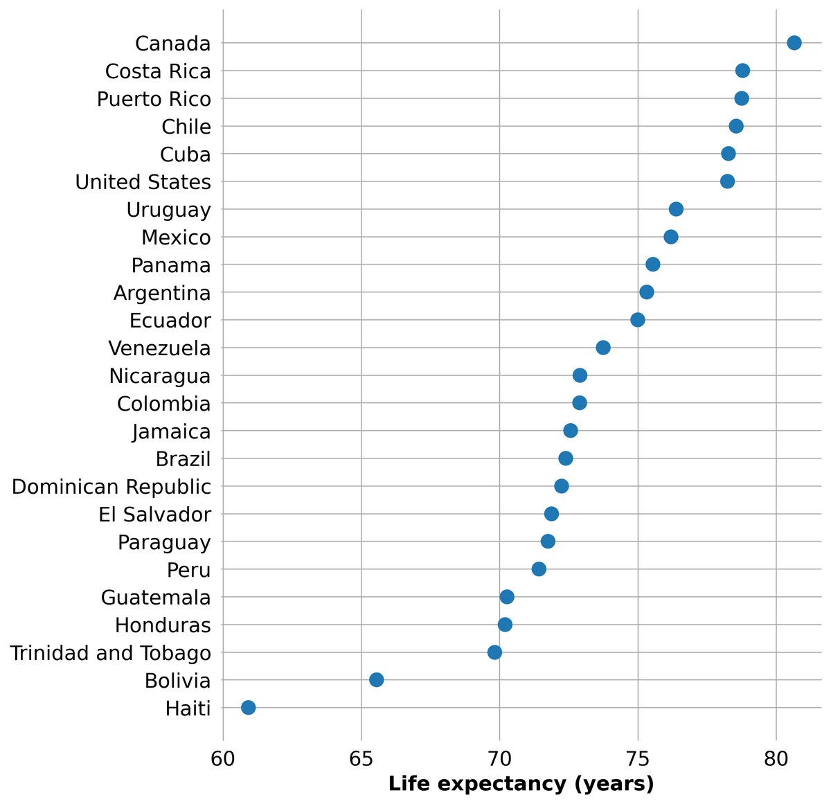
❓ What is the issue with bars?
🔴 Bars need to start from zero - cannot limit the axis range
🔴 Bars take away much space on figures
🔴 Hard to visualize small differences
This example looks like a picture of a lake 🔽
Hard to see the differences.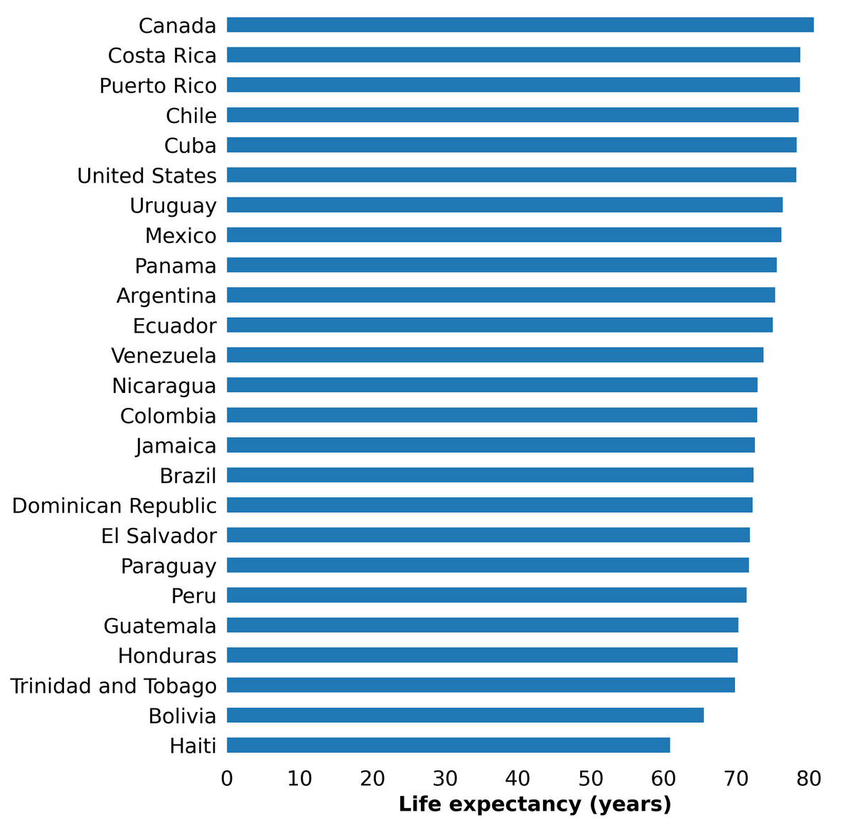
Now the same data on a dot plot 🔥
🟢 Dots pull the eyes to the important part
🟢 Easy to visualize differences
🟢 We can limit the axis range
🟢 Chart is not crowded